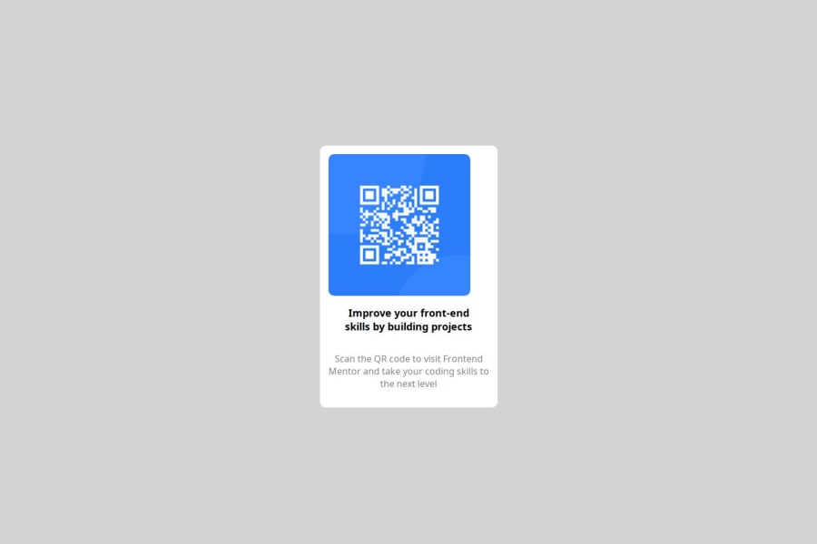
Design comparison
Solution retrospective
Using Figma was challenging and I wasn't able to figure out how to get correct dimensions from Figma - so I ended up estimating the sizes as opposed to being fully precise about it.
What specific areas of your project would you like help with?Look at my CSS to ensure that I have properly implemented the solution.
Community feedback
- @MikDra1Posted 2 months ago
Good job! Here are some things to review:
-
Setting
background-color: lightgrey;
on the<body>
tag is a good start for defining a neutral background. However, using lighter colors might cause low contrast with certain text or elements, potentially affecting accessibility. Make sure to check your color contrast for readability. -
The
.container
class usesdisplay: flex;
to center elements both horizontally and vertically withjustify-content: center;
andalign-items: center;
. This is a great way to ensure that content stays centered regardless of screen size. Just keep in mind, usingheight: 100vh;
might cause issues on mobile devices where the address bar or bottom controls can push elements off the screen. Instead you can usemin-height: 100vh;
. -
The
.content
class useswidth: fit-content;
which is useful for making the content box dynamically adjust based on its contents. However, be mindful of scenarios where content could overflow. Consider addingmax-width
to handle such cases gracefully on smaller screens. -
Using
border-radius: 10px;
on both the.content
class andimg
tag is a nice touch for giving your elements a soft, rounded appearance. Rounded corners can improve the visual appeal and provide a more modern look. -
The
.desc
class hasopacity: 50%;
, which is fine for creating a subtle effect, but it may negatively impact readability for users with visual impairments. Consider using a darker shade with full opacity or improving contrast to maintain clarity while achieving the same visual effect. -
Avoid using fixed sizes like
px
βfor example, on font sizes or padding. Instead, use responsive units likerem
orem
to ensure that your design scales better across devices. For instance, settingfont-size: large;
in.header
can be replaced with a more flexiblerem
unit to adapt to different user settings. -
Avoid commenting out code indefinitely, like the
.box
class in this case. If it's not being used, it's better to remove it. Commented-out code can clutter your stylesheets and make maintenance harder as your project grows.
Hope you found this comment helpful πππ
Good job and keep going πππ
Marked as helpful1 -
Please log in to post a comment
Log in with GitHubJoin our Discord community
Join thousands of Frontend Mentor community members taking the challenges, sharing resources, helping each other, and chatting about all things front-end!
Join our Discord