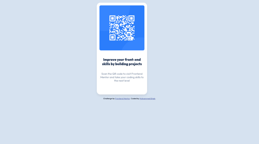
QR Code Component using Flexbox
Design comparison
Solution retrospective
Feedback Please
Community feedback
- @zenab12Posted almost 3 years ago
Hey!! Congratulations for completing this challenge.. .
Here are my suggestions..
1-You should use
<main class="container">instead of<div class="container">to make code more semantic and put inside it<figure class="card"></figure>.2-Go down orderly when you are using the headings h1 down to h2 down to h3 and so on . so use h1 instead h3 and change font-size if you want ..
3-You can wrap your
<div class ="attribution">in a footer tag like this<footer><div class="attribution"></div></footer>to avoid accessibility issues.4-You should use representative name for alt attribute in
<img>and don't let "alt" attribute empty as if network is low or happen error in image the representative name will appear instead of img , and if e-reader read the website will read the image with it's "alt" value.This should fix most of your accessibility and html issues
--------------------------------- And To make code more semantic and readable ----------------------------------
1- Use <figure> instead <div class="card"> to make code more semantic and understandable for e-reader
2- remove transform: translateX(515px); from
div.cardand card will center automatically if used code mentioned below.3- remove margin from card , body and main.
3- to center Card in the page use this code :
**/*it is the container and remove padding in the body flex-box solve all problems*/**
body {margin :0;display:flex;flex-direction:column; min-height:100vh}

**/*it is a child and we make flex-grow:1 to distribute space-equally in top and bottom*/**
main{display:flex;place-items:center;place-content:center;flex-grow:1}

**/*you can make it in this challenge to get identical design but don't make it in really site you work on as semantic layout should contain header,main,nav,footer,etc.*/ **
footer{display:none;margin:0}
Tip: dont' forget to check your code on w3validator to know if your code structure correct or not .
Regardless you did amazing... hope you find this useful... Happy coding and nice day for you!!!
Marked as helpful2 - P@LucianoDLimaPosted almost 3 years ago
Hi there! Good job on completing this challenge!
There are a few ways of centering your container in the screen which makes so it is responsive in all screen sizes.
My favourite is flex, apply that to the body:
display: flex;flex-direction: column;align-items: center;For that to work you must first remove
transform: translateX(515px);from your card. If you want to look further, I suggest looking up the following display: flex / flex-direction: column / flex-direction: row / align-items: .. / justify-content: ..Happy coding!
Marked as helpful1 - @OGShawnLeePosted almost 3 years ago
Hey! Here's some feedback for you.
About HTML:
- All of your main content should be wrapped inside of a main tag.
- Your page should have an h1 tag. Change the h3 for an h1 and its solved.
- Image tags must have an alt attribute. Which can be left blank if the image is used for decoration.
About CSS:
- Add someting like this to your body. This will center your content properly regardless of viewport.
body { display: flex; flex-direction: column; align-items: center; justify-content: center; gap: 7.5rem; /* this will add some nice gap between your card and the attribution */ min-height: 100vh; }- Remove this from you card:
transform: translateX(515px); - Use relative units like rem instead of px.
I am not a plain CSS fan so I can't provide much feedback there, yikes: T-T
Hope this helps. Have a great day!
1
Please log in to post a comment
Log in with GitHubJoin our Discord community
Join thousands of Frontend Mentor community members taking the challenges, sharing resources, helping each other, and chatting about all things front-end!
Join our Discord
