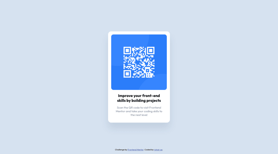
Design comparison
Solution retrospective
I used used Flexbox to align main content in the center of viewport, and attribution element was messing with alignment. I used absolute positioning to exclude it from the flow and position it at the bottom of the page. Is there any best practice solution to position element at the bottom of the page and do not influence flexbox alignment?
Community feedback
- @DavidMorgadePosted over 2 years ago
Hello and congratulations on finishing the challenge!
In this particular case, you could have use
flex-direction: columnin yourbody, with that you will get both elements themainand thefooterfull centered.In the case you want to position your
footerat the end of the flex, using absolute positioning is not that bad idea since there isn't ajustify-selfproperty for flexbox, other way you could have archive this is changing the structure of your html and put yourfooteroutside of the flex, for example having your flex in themainand the component inside asectiontag.Hope my feedback helps you! good job
Marked as helpful1 - @correlucasPosted over 2 years ago
👾Hello Rishat, congratulations for your solution!
Answering your question:
There are many ways to align this component, you can use
position: relative/absolute, usedisplay: grid, but you've done with the best way (my opinion) and more easy way too. With flexbox you don't need to manage many properties and have a lots of control over the elements, I guess you did the best choice for this challenge.Your solution is really good and responsive, for me the only thing you've missed is giving a margin around the container to avoid the card touching the screen bounds when the solution becomes mobile, fix that doing
main {margin: 24px;};Congrats for the clean code and this beautiful solution!
Keep it up and happy coding!
Marked as helpful1@rishat-sePosted over 2 years ago@correlucas Hello Lucas!
Updated css to fix margin issue. Thank you for your feedback! It was very helpful.
0
Please log in to post a comment
Log in with GitHubJoin our Discord community
Join thousands of Frontend Mentor community members taking the challenges, sharing resources, helping each other, and chatting about all things front-end!
Join our Discord
