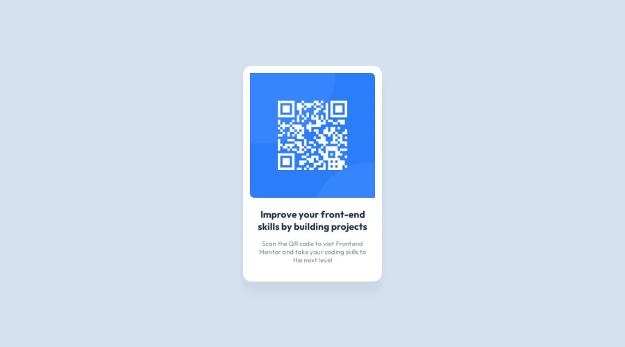
Design comparison
SolutionDesign
Solution retrospective
Feedback is very welcome!
Community feedback
- @PabloBezerraPosted about 1 year ago
Congratulations for your work! It was very faithful! However, what caught our attention the most was that the title of the card has an
<h3>tag, ideally it should always start with an<h1>tag, if it doesn't have the desired size, just modify it in the CSS . Another thing was that you imported a text font directly into the HTML, the ideal is to import style fonts into the CSS document itself with @import. Hope this helps! Hugs!Marked as helpful0
Please log in to post a comment
Log in with GitHubJoin our Discord community
Join thousands of Frontend Mentor community members taking the challenges, sharing resources, helping each other, and chatting about all things front-end!
Join our Discord
