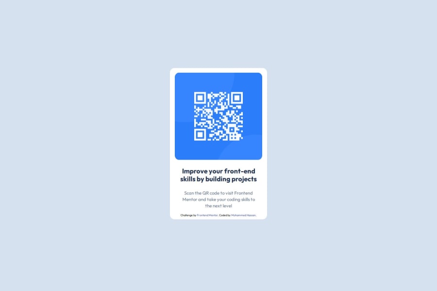


Design comparison

Solution retrospective
that is my first time use figma designs
What challenges did you encounter, and how did you overcome them?extract data from figma files and i have to search on youtube
What specific areas of your project would you like help with?that is my first challange,I would like to receive feedback to improve myself to be able to have my first job as frontend developer
Community feedback
- @beowulf1958Posted about 1 month ago
Congratulations on completing this challenge. Your component looks great. On the desktop version, the component is centered nicely. However, on the mobile view, the bottom of the component is hidden from view, requiring some vertical scrolling, which is annoying. Most people use their phones to surf the web, which is why mobile-first design is preferred.
The problem is you used margins and transform-Y without adding media queries to account for different screen sizes. A better way to handle this is to use flex display on the containing element.
Remove the margins and transform from div-container. Then add to the body element
  display: flex;
  flex-direction: column;
  justify-content: center;
  align-items: center;
  min-height: 100vh;
Now your component centers correctly at all screen sizes. Hope this helps. Keep challenging yourself and getting better.
Marked as helpful1P@Mohammed-BataPosted about 1 month ago@beowulf1958 thank you for your time, I solve it
0 - @AugustMattPosted about 1 month ago
Hi! Cool project! I think there might be some spacing that made your card stick out a bit. Try checking the margin of the elements to see if you can find it.
Marked as helpful1


Please log in to post a comment
Log in with GitHub
Join our Discord community
Join thousands of Frontend Mentor community members taking the challenges, sharing resources, helping each other, and chatting about all things front-end!
Join our Discord