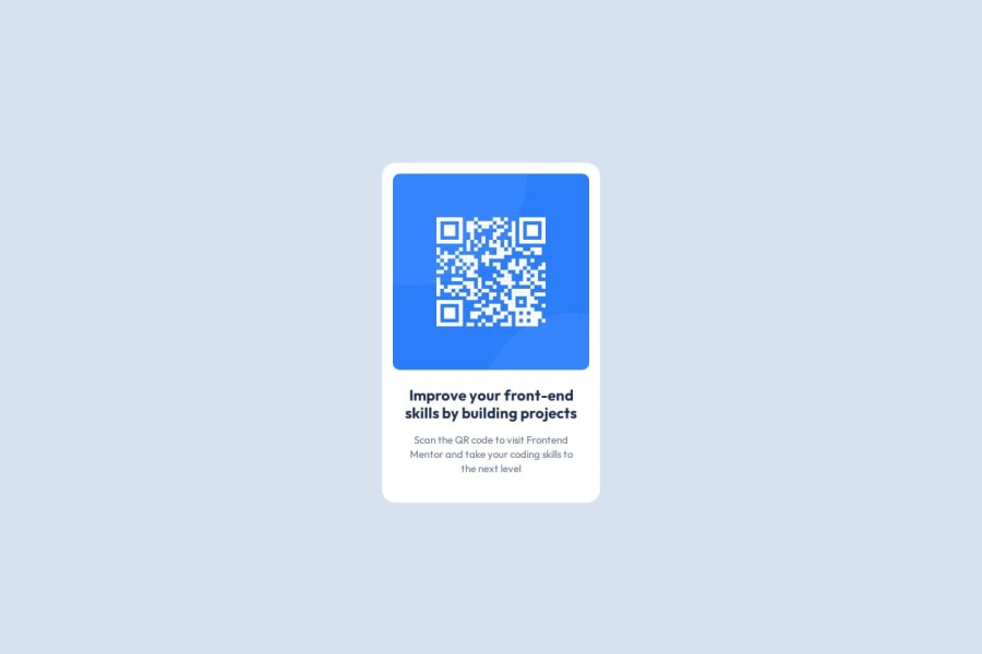
QR Code Component using flex and centered by grid.
Design comparison
Solution retrospective
It is my First build. So I am proud of the project itself.
Next time I will try to do it in all grid.
What challenges did you encounter, and how did you overcome them?The challenge I encountered was center the div in the body itself.
I over come this by Using Grid. Before I tried do with flex and position, somehow it didn't work for me.
What specific areas of your project would you like help with?I want help in reducing code and finding what is most effective way to do this in real work environment. That's it.
Community feedback
- P@JocelyneTeles98Posted 6 months ago
Your solution is well done! It is almost like the original design. I recommend to try with grid. I actually explored it a bit with my own solution (I used to employ "display: flex" for everything) but I'm trying to go with other solutions. Nice job!
0 - P@cravskyPosted 6 months ago
Well done! Congratulations on finishing this challenge!
Here are some of the great aspects of your project:
- You took the time to provide a comprehensive README file and clear commit messages.
- The design meets expectations.
- You correctly embedded custom fonts.
- You utilized CSS variables for colors, which improves maintainability.
Regarding the centering of the div, it seems there was some difficulty, but I’m not entirely sure what specific issues you encountered. I suggest trying a simpler approach by avoiding the grid and using flexbox instead, which may be easier to work with. Here's a revised version of your code:
main {
  /* display: grid; */
  /* place-items: center; */
  display: flex;
  justify-content: center;
  align-items: center;
  height: 100vh;
  width: 100%;
}
Keep up the great work!
0
Please log in to post a comment
Log in with GitHubJoin our Discord community
Join thousands of Frontend Mentor community members taking the challenges, sharing resources, helping each other, and chatting about all things front-end!
Join our Discord
