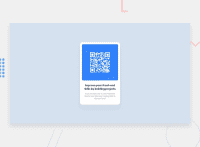
Design comparison
Solution retrospective
What would be best practice for positioning card? Is my solution any good? Thanks for feedback!!
Community feedback
- @MelvinAguilarPosted about 2 years ago
Hi @half-cto 👋, good job on completing this challenge! 🎉
Here are some suggestions you might consider:
- Centering the element with position would make your element behave strangely on some mobile devices. There are two modern CSS techniques to center elements instead of using the position property.
Using flexbox layout:
body {
   margin: 0;
   width: 100%;
   min-height: 100vh;
   display: flex;
   flex-direction: column;
   justify-content: center;
   align-items: center;
}
Using grid layout:
body {
   margin: 0;
   width: 100%;
   min-height: 100vh;
   display: grid;
   place-content: center;
}
Also, remove the position properties.
.info-card {
    display: flex;
    flex-direction: column;
    /* position: absolute; */
    /* top: 9.5rem; */
    /* left: 50%; */
    /* transform: translate(-50%, 0%); */
    max-width: 320px;
    min-height: 497px;
    /* overflow: hidden; */
    background-color: #FFF;
    border-radius: 20px;
    padding: 1rem;
}
Links with more information:
- The Complete Guide to Centering in CSS.
- A Complete Guide to Flexbox (CSS-Tricks).
- How TO - Center Elements Vertically (W3Schools).
- CSS Layout - Horizontal & Vertical Align (W3Schools).
Other suggestions:
- In this challenge, you can use the <img> tag directly because the image does not change.
I hope those tips will help you.
Good job, and happy coding!
Marked as helpful2@half-ctoPosted about 2 years ago@MelvinAguilar thank You for taking time for in depth reply! I tried to center card using flex on body, but didn't think of changing flex direction, thanks again.
0 - @correlucasPosted about 2 years ago
👾Hi JZ, congratulations on your solution!👋 Welcome to the Frontend Mentor Coding Community!
Great solution and a great start! From what I saw you’re on the right track. I’ve few suggestions for you that you can consider adding to your code:
- Use
<main>instead of a simple<div>this way you improve the semantics and accessibility showing which is the main block of content on this page. Remember that every page should have a<main>block and that<div>doesn't have any semantic meaning. - Replace the
<h2>containing the main title with<h1>note that this title is the main heading for this page and every page needs one h1 to show which is the most important heading. Use the sequence h1 h2 h3 h4 h5 to show the hierarchy of your titles in the level of importance, never jump a level. - Add a margin of around
margin: 20pxto avoid the card touching the screen edges while it scales down. - Use relative units as
remoreminstead ofpxto improve your performance by resizing fonts between different screens and devices. These units are better to make your website more accessible. REM does not just apply to font size, but to all sizes as well.
Here's my solution for this challenge if you wants to see how I build it: https://www.frontendmentor.io/solutions/qr-code-component-vanilla-cs-js-darklight-mode-nS2aOYYsJR
✌️ I hope this helps you and happy coding!
Marked as helpful1@half-ctoPosted about 2 years ago@correlucas Thank You! Your comment has a lot of great information, much appreciated!!
0 - Use
Please log in to post a comment
Log in with GitHubJoin our Discord community
Join thousands of Frontend Mentor community members taking the challenges, sharing resources, helping each other, and chatting about all things front-end!
Join our Discord

