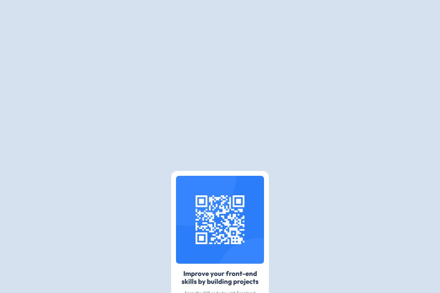
Design comparison
Solution retrospective
I am most proud of how I set up my file structure to ensure the CSS is tidy and injected seperately from the index.html. I am also proud of the fact I ensured this project would be maintanable by using CSS variables to make it easy to change background and text colours. Next time I would also create a CSS variable for the font family to make it even more maintainable going forward. I would also maybe make the h2 a tag instead as the text is longer.
What challenges did you encounter, and how did you overcome them?I was unsure why the image and headings were not centering when applying CSS properties "display: block" and "margin: 0 auto" however realised it was because I had not yet set the max-width on my div therefore there was no room for the content to move. I realised this after reading a few posts on Stack Overflow and re-looking at the Figma design.
What specific areas of your project would you like help with?Potentially how else would have been a good way to centre the content vertically as currently you have to scroll to see the component within the viewpoint.
Community feedback
Please log in to post a comment
Log in with GitHubJoin our Discord community
Join thousands of Frontend Mentor community members taking the challenges, sharing resources, helping each other, and chatting about all things front-end!
Join our Discord
