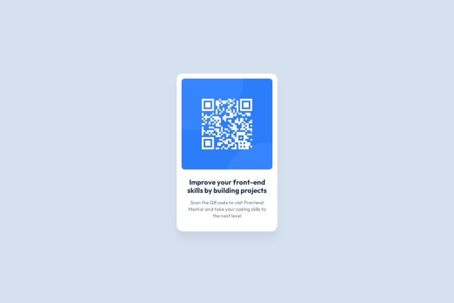
Design comparison
SolutionDesign
Solution retrospective
What are you most proud of, and what would you do differently next time?
Refreshed on some basic HTML and CSS concepts. Went with CSS Grid as it seems the most flexible and I wanted a refresher.
What challenges did you encounter, and how did you overcome them?I translated the Figma design as much as possible. It wanted to use flex but I felt CSS Grid was the way to go here. So i refreshed my CSS Grid knowledge by doing the CSS Grid Garden mini games and read up on MDN
Community feedback
Please log in to post a comment
Log in with GitHubJoin our Discord community
Join thousands of Frontend Mentor community members taking the challenges, sharing resources, helping each other, and chatting about all things front-end!
Join our Discord
