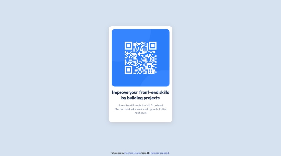
Design comparison
Solution retrospective
Hi! 👋
With semantic HTML, would div be ok in this situation to wrap the QR component or is there a more appropriate tag that should have been used?
HTML
<main>
    <div class="card">
      <img src="images/image-qr-code.png" alt="QR Code for Frontend Mentor" />
      <h1>Improve your front-end skills by building projects</h1>

      <p>
        Scan the QR code to visit Frontend Mentor and take your coding skills
        to the next level
      </p>
    </div>
  </main>
Community feedback
- @HassiaiPosted over 1 year ago
Give h1 and p the same font-size of 15px which is 0.9375rem and the same margin-left, margin-right and margin-top values.
Use relative units like rem or em as unit for the padding, margin, width values and preferably rem for the font-size values, instead of using px which is an absolute unit. For more on CSS units Click here
Hope am helpful.
Well done for completing this challenge. HAPPY CODING
Marked as helpful1@rebcopPosted over 1 year ago@Hassiai Thank you for the detailed feedback and resource! :) Is the margin-top property preferred over the gap property that's used for flexbox?
0 - @g-pgPosted over 1 year ago
Hey, Rebecca.
The <section> tag would be appropriate in this case. It points to a semantically distinct element on your page, as is the case of a "card".
Marked as helpful1
Please log in to post a comment
Log in with GitHubJoin our Discord community
Join thousands of Frontend Mentor community members taking the challenges, sharing resources, helping each other, and chatting about all things front-end!
Join our Discord
