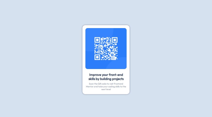
Design comparison
Solution retrospective
I learned how to use the flexbox to make a responsive page.
I would use more HTML5 semantics and learn more about CSS pre-processors.
What challenges did you encounter, and how did you overcome them?I had challenges on how to use flexbox and how it worked.
What specific areas of your project would you like help with?I want feedback about best practices, accessibility and other tools to facilitate the job.
Community feedback
- @mbtenkorangPosted 10 months ago
Congratulation 🎉🎉🎊🥳
A few tips
-
Instead of using the
<br>element to create a space between thediv.cardanddiv.attribution, you may consider using a margin value instead. You can read more about the use of the <br> element in this MDN- The Line Break element article. -
You may have received a validation error notice about the
div.attributionelement. A better semantic structure is to usefooter.attribution.
All thhe best and happy coding 😁🧑💻
Marked as helpful0 -
Please log in to post a comment
Log in with GitHubJoin our Discord community
Join thousands of Frontend Mentor community members taking the challenges, sharing resources, helping each other, and chatting about all things front-end!
Join our Discord
