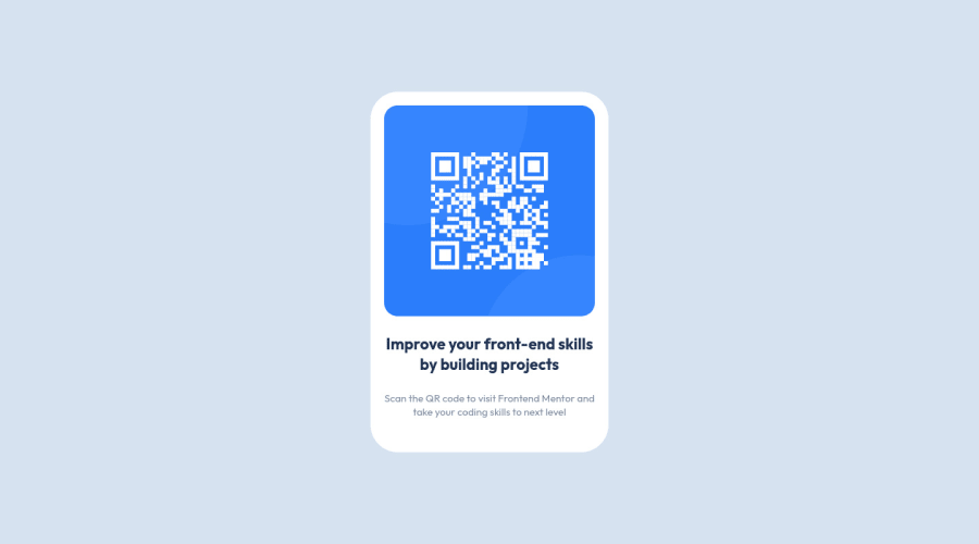
QR code component using CSS Flexbox
Design comparison
Solution retrospective
How do you think how clean and adaptive my code is?
Community feedback
- @romila2003Posted over 2 years ago
Hi Oleh,
Welcome to the frontend mentor community and congratulations for 🎉 for completing your first challenge, the card looks good, and it is great that you used the
flexproperty to center the card. However, I found some issues I want to address:- It is best practice to wrap the main content within the
maintag which would ensure that your content is wrapped within the correct landmarks e.g.<main class="container"></main> - To give your code a cleaner look through less code, you can do something like this:
<main class="container">
   <img src="image-qr-code.png" alt="qr-code">
   <h1>Improve your front-end skills by building projects</h1>
   <p>Scan the QR code to visit Frontend Mentor and take you coding skills to the next level</p>
</main>
Overall, great work and wish you the best for your future projects so keep coding 👍.
Marked as helpful1 - It is best practice to wrap the main content within the
- @correlucasPosted over 2 years ago
👾Hello Oleh Lykho, congratulations for your first solution!👋 Welcome to the Frontend Mentor Coding Community!
Great start and great first solution! You’ve done really good work here putting everything together, I’ve some suggestions you can consider applying to your code:
Something I've noticed in your code is that in many occasions you've added some
<div>to wrap contents that don't really need to be inside of a div block. Note that for this challenge all you need is a single block to hold all the content, can be<div>or<main>if you want to use a semantic tag to wrap the content, the cleanest structure for this challenge is made by a block of content with div/main and all the content inside of it (img, h1 and p) without need of any other div or something. See the structure below:<body> <main> <img src="./images/image-qr-code.png" alt="Qr Code Image" > <h1>Improve your front-end skills by building projects</h1> <p>Scan the QR code to visit Frontend Mentor and take your coding skills to the next level</p> </main> </body>Use
<main>instead of<div>to wrap the card container, its better to use<main>in this case because you’re indicating that’s the main block of content of this page and also because<div>doesn’t have any meaning, it's just a block element.✌️ I hope this helps you and happy coding!
0
Please log in to post a comment
Log in with GitHubJoin our Discord community
Join thousands of Frontend Mentor community members taking the challenges, sharing resources, helping each other, and chatting about all things front-end!
Join our Discord
