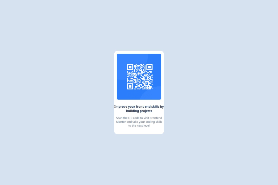
QR Code Component using CSS Flexbox
Design comparison
Solution retrospective
I’m most proud of how I was able to translate the design specifications into a fully responsive web page component. It was rewarding to see my initial sketches and ideas come to life with HTML and CSS. I also enjoyed experimenting with responsive design techniques, ensuring the layout looked good on different screen sizes. Completing the project gave me a deeper understanding of flexbox principles and how to effectively use CSS properties. Next time, I would allocate more time for planning and prototyping before jumping into coding. While I was able to finish the project, I realized that a more structured approach could help streamline the process. I’d also like to focus more on accessibility features to ensure a better experience for all users.
Community feedback
Please log in to post a comment
Log in with GitHubJoin our Discord community
Join thousands of Frontend Mentor community members taking the challenges, sharing resources, helping each other, and chatting about all things front-end!
Join our Discord
