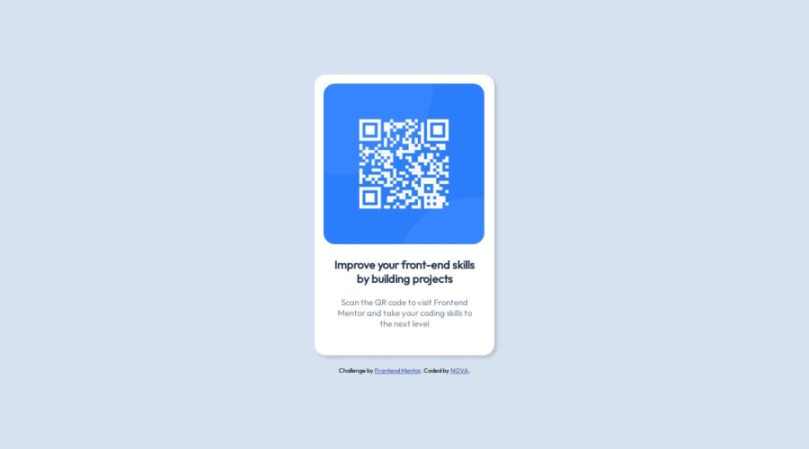
Design comparison
SolutionDesign
Solution retrospective
How can I improve responsive?
Because, for example, I've played with the height of the page but I'd have liked this to be done automatically depending on the screen without having to enter a precise number of pixels.
More specifically, I'd like the body of the page to take up all the space, whatever the screen size.
Thanks
Community feedback
- @mayankdrvrPosted about 1 year ago
Congratulations @NovaMakeIt for completing this challenge. Your design matches the solution very well.
Here are a few observations-
- Below 323px width of screen, the text and card gets partially hidden, the text does not wrap and the image does not resize. Maybe, you can make it more responsive by setting the maximum width of card to be upto 100% of width of its parent container(body). See if using this CSS property in image styling can make the image more responsive-
max-width: 100%;. Usemin-height: 100vh;in body styling for body to take up all the space of the viewport. - Avoid using <div> element in html file and use semantic html elements throughout the code for better web accessibility.
- Using noopener and noreferer in <a> elements is a good security practice with cross browser compatibility.
- Try to use the Block Element Modifier(BEM) naming method as a good practice of naming classes for referencing html elements in the css file.
- Use relative dimensions like rem wherever possible.
Modified html body(i have left BEM naming for your practice)-
  <div class="card">
    <img src="./images/image-qr-code.png" alt="A QR code" class="qr-code" />
    <h2 class="heading">Improve your front-end skills by building projects</h2>
    <p class="description">Scan the QR code to visit Frontend Mentor and take your coding skills to the next level</p>
  </div>
Modified css file-
* {
    margin: 0;
    padding: 0;
    font-size: 15px;
    box-sizing: border-box;
}

body {
    font-family: "Outfit", sans-serif;
    background-color: hsl(212, 45%, 89%);
    display: flex;
    flex-direction: column;
    justify-content: center;
    align-items: center;
    min-height: 100vh;
}

.card {
    width: 320px;
    height: 497px;
    border-radius: 20px;
    background-color: hsl(0, 0%, 100%);
    box-shadow: 5px 5px 5px rgba(90, 89, 89, 0.2);
    max-width: 100%;

}

.qr-code {
    padding: 16px 16px 0px 16px;
    max-width: 100%;
    border-radius: 0.625rem;
}


.heading {

    margin: 10px 34px 0 34px;
    font-size: 20px;
    text-align: center;
    font-weight: 700;
    color: hsl(218, 44%, 22%);
}

.description {

    margin: 20px 30px;
    font-size: 15px;
    text-align: center;
    font-weight: 400;
    color: hsl(220, 15%, 55%);
}

.attribution {

    text-align: center;
    margin-top: 20px;
}

.attribution a {
    color: hsl(228, 45%, 44%);
}
Awesome solution and keep it up.
Marked as helpful0 - Below 323px width of screen, the text and card gets partially hidden, the text does not wrap and the image does not resize. Maybe, you can make it more responsive by setting the maximum width of card to be upto 100% of width of its parent container(body). See if using this CSS property in image styling can make the image more responsive-
Please log in to post a comment
Log in with GitHubJoin our Discord community
Join thousands of Frontend Mentor community members taking the challenges, sharing resources, helping each other, and chatting about all things front-end!
Join our Discord
