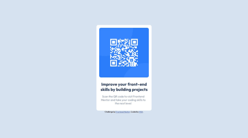
QR code component using CSS flexbox

Solution retrospective
In the past I stuck at defining multiple DIV and end up confusing myself with complex CSS script. Then I saw how the expert did it, first just focus on getting the components appear in correct order. Then only tweak the font size, padding, margin, etc
What challenges did you encounter, and how did you overcome them?The challenge I encounter is to decide whether to use display grid or flex. For QR code challenge, I find flex is simple enough for a one column content. I manage to check on other solutions using display grid with place-content: center to make the component appears on the center. Flex requires adding "align-items" and "justify-content"
What specific areas of your project would you like help with?I have problem using Figma, I manage to open the design asset in Figma but I can't figure out how to use Figma to check the spacing from the QR code to the title and paragraph. I will try to find some examples on how to use Figma properly.
Please log in to post a comment
Log in with GitHubCommunity feedback
No feedback yet. Be the first to give feedback on MS's solution.
Join our Discord community
Join thousands of Frontend Mentor community members taking the challenges, sharing resources, helping each other, and chatting about all things front-end!
Join our Discord