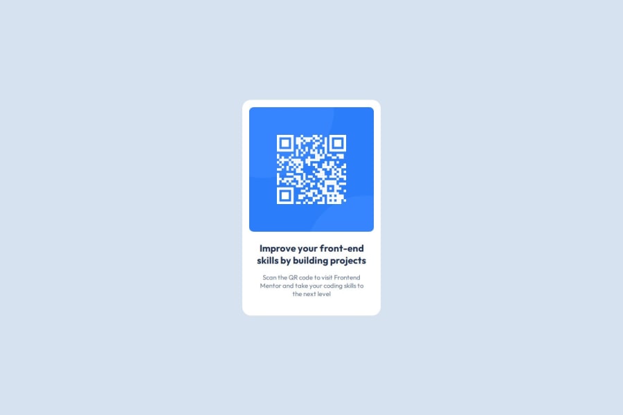
QR Code Component using CSS Flexbox
Design comparison
Solution retrospective
I am most proud of successfully using just CSS Flexbox to dispose elements both horizontally and vertically, creating a clean and responsive design. Next time, I would explore using CSS Grid for more complex layouts and work on enhancing accessibility by adding ARIA roles and attributes.
What challenges did you encounter, and how did you overcome them?One of the main challenges I faced was ensuring the QR code component matched the design perfectly. I overcame this by carefully examining the design details. Additionally, making sure the design looked good on different screen sizes without using media queries was challenging, but I managed to achieve a responsive design by centering elements effectively.
What specific areas of your project would you like help with?I would like any suggestions on enhancing the accessibility of the component.
Community feedback
- @shahidafridi-321Posted 8 months ago
done
0P@JomagenePosted 8 months ago@shahidafridi-321 Thanks! Do you have any feedback for my improvement?
0
Please log in to post a comment
Log in with GitHubJoin our Discord community
Join thousands of Frontend Mentor community members taking the challenges, sharing resources, helping each other, and chatting about all things front-end!
Join our Discord
