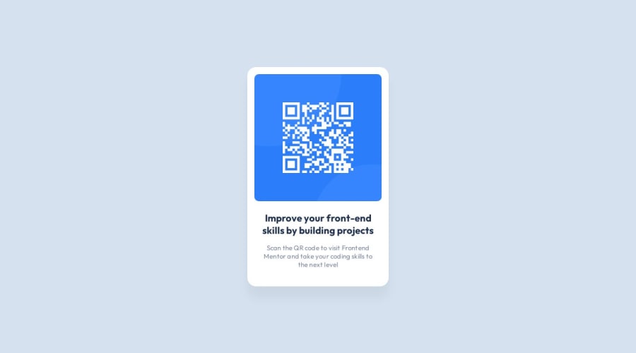
Design comparison
SolutionDesign
Community feedback
- @Mennatallah-HishamPosted about 1 year ago
Hi vkomerystyi,
Congratulations on completing your first challenge👏
You did great 👍
Here are some suggestions to improve your code:
Semantic HTML
- wrap your content in <main>,this element represents the dominant content of the <body>
- wrap your card in <article>
<main>
<article>
</article>
</main>
<footer>
</footer>
ALT
- images should have descriptive alt text, which is important for SEO and screen reader users,alt="QR code linking to Frontend Mentor challenges"
SEO
- you can add meta description for better SEO, it provides a summary of a web page
<meta name="description" content="..........."/>here are some helpful articles:
Hope you find this helpful, Happy Coding
0
Please log in to post a comment
Log in with GitHubJoin our Discord community
Join thousands of Frontend Mentor community members taking the challenges, sharing resources, helping each other, and chatting about all things front-end!
Join our Discord
