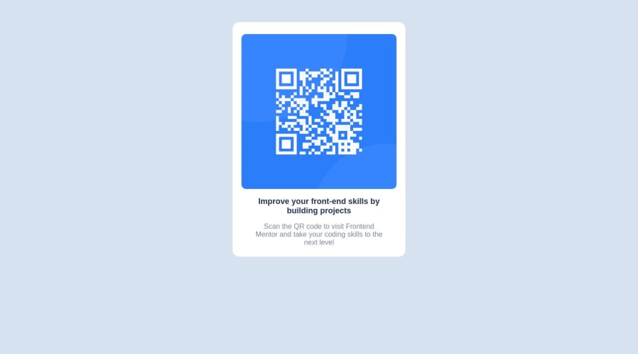
Design comparison
Solution retrospective
I have been able to build this QR component as closely as it has been given me but what I still don't have a lot of control over is the usage of 'Media queries' and what factors or basic understanding you should have about it, although it talks about breakpoints and specifying/optimizing and prioritizing screen size. I want to really know more on it.
Community feedback
- @mah07308Posted almost 2 years ago
Media queries are basically used when the designs are different for different devices(mobiles, tablets, desktop etc).
Example: If we're making a website for a mobile and a desktop. We can first write the code for the mobile device and then make the appropriate layout changes to switch to the desktop design at a specific width. This width for desktops/laptops is usually 1028px.
So in our code to seperate the mobile design and the desktop design, We'll use a media query.
@media(min-width: 1028px) {
/* changes for desktop here */
}
Whatever changes are needed for our desktop design will be written inside the curly braces of the media query and will be implemented whenever the browser width is more than 1028px.
You can go through this responsive web design RWD tutorial to learn more.
I hope this helps.
0 - @MelakuAlehegnPosted almost 2 years ago
I loved how responsive the page is with title media query. The only thing I think you should change is setting your card component a bit of height property. it looks shorter on your design. apart from that I found this great and clean code. I have a challenge on the width of the component since I used % as a unit of width for card component, but you make that easier by setting the width in pixes.
0
Please log in to post a comment
Log in with GitHubJoin our Discord community
Join thousands of Frontend Mentor community members taking the challenges, sharing resources, helping each other, and chatting about all things front-end!
Join our Discord
