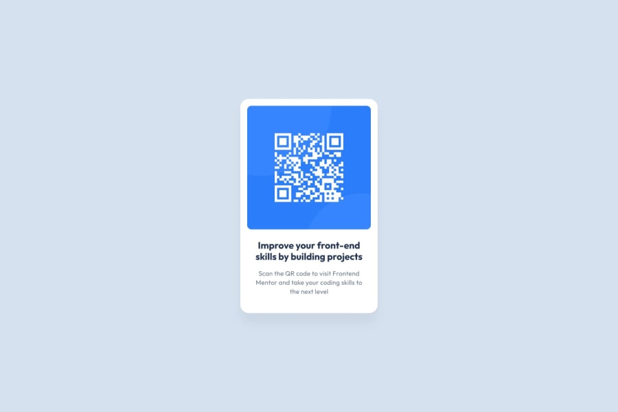
Design comparison
SolutionDesign
Community feedback
- @EdenExperimentsPosted over 2 years ago
Consider how this would look to a user, yes it does scale nicely but how does it actually look on devices?
Above is how it looks on an Iphone 12 pro, so much space is margin and could be effectively used more, also, this is going to look tiny and the text is not accessible.
A solid attempt however I do want to say! :)
Marked as helpful1
Please log in to post a comment
Log in with GitHubJoin our Discord community
Join thousands of Frontend Mentor community members taking the challenges, sharing resources, helping each other, and chatting about all things front-end!
Join our Discord
