Not Found
Not Found
Not Found
Not Found
Not Found
Not Found
Not Found
Not Found
Not Found
Not Found
Not Found
Not Found
Not Found
Not Found
Not Found
Not Found
Not Found
Not Found
Not Found
Not Found

Submitted

QR Code Component using CSS Custom Properties

Linda Jensenā€¢ 80

@lindajensen

Desktop design screenshot for the QR code component coding challenge

This is a solution for...

  • HTML
  • CSS
1newbie
View challenge

Design comparison


SolutionDesign

Solution retrospective


What are you most proud of, and what would you do differently next time?

This might sound silly, but i think the thing I'm most proud of is that I didn't give up. I've been in a place for a few weeks where things have been kind of hard and I don't get a lot of enjoyment out of anything. But I keep coding and I'm not giving up. When it comes to the actual code I think what I'm most proud of is centering a div (is that embarrassing?). I'm new to coding and I never seem to be able to figure that out without ChatGPT, but not this time. I figured it out by myself (there was some Googling involved).

I'm not sure if I was suppose to use media queries in this, but it didn't seem like it was needed. But if I was to redo it I'd probably pay more attention to that.

What challenges did you encounter, and how did you overcome them?

Centering a div. But I did not take the easy way out and ChatGPT'd it. Not that there's anything wrong with that, but for me what I've noticed is that when I just AI something it doesn't seem to stick. And I'm new to this so I need to find other solutions as well. I want to really learn this and so I can't just take the easy way out as soon as I get frustrated.

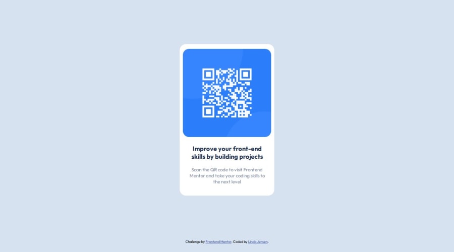
What specific areas of your project would you like help with?

  1. I need help with how I get the padding (you know the white frame around the qr-code and text) even all the way around? I just couldn't figure it out. But then again, me and padding needs to get better acquainted with each other. So maybe you could help a gal out.
  2. I also really want the question "Was I suppose to use media queries in this challenge?" answered. Because the site worked fine until around 318px in width so I'm thinking no. But what's your opinion?

Community feedback

P
Rupaliā€¢ 780

@rupali317

Posted

Hello @lindajensen

Great work on your first challenge. Kudos for not giving up!

For question 1, I recommend the following changes:

The QR image should not have a fixed width of 300px as it can cause issues on how the padding is displayed. It is better to use percentage since it indicates how much percentage of the parent's width the child element will occupy. I recommend doing the following in your CSS for your img element:

img {
    max-width: 100%;
    border-radius: 10%;
}

After that in your card class, you can have the padding as 20px. This means that 20px is applied uniformly on top, right, bottom and left of the card.

.card {
    background-color: var(--white);
    display: flex;
    flex-direction: column;
    justify-content: center;
    align-items: center;
    padding: 20px;
    border-radius: 20px;
    margin: 0 auto;
    max-width: 300px;
}

Let me know if this helps

My 2 cents, avoid using pixels. A better unit is rem since pixels are fixed and cannot scale well. rem is better for scaling and it enhances your accessibility.

For your question 2, media-queries are not needed

Great job! Keep coding!

Marked as helpful

0

Linda Jensenā€¢ 80

@lindajensen

Posted

Thanks! This helped quite a bit. I changed the border-radius as well and the result is a lot better. @rupali317

1

@jsklcodes

Posted

šŸ™‹ā€ā™€ļø Hi Linda! Based on your code and your problems with this challenge, I have a few suggestions for you:

  1. The padding of the card should be the same at the top and sides, which will leave the frame around the image. It should be slightly larger at the bottom. The padding property is an abbreviation, you can define each of these spacings with a single padding property. So: padding: top right bottom left;. That's enough to solve your problem, but if you want to understand more about it, I suggest you read about how it works and the syntax of paddings in MDN.
  2. It's not necessary to use media queries in this challenge; there are ways to make the width of an element responsive without using them, which is the case here. I recommend you take a look at width and max-width, which can be used together to do this.

āœØ You can make some small improvements:

  • The title of the card should be a bit bigger, 22px.
  • I recommend you remove the attribution from your solution, as this will affect the alignment and comparison with the design. Leave an attribution in the README of the project.
  • There are some spacing differences compared to the design; resolving them will bring your solution closer. Did you consult the design in Figma or Sketch?
  • In the design, the card dimensions are 320x497, but you don't need to set fixed sizes to get this result. As you add the necessary spacing, it will be adjusted. Remember that the width can be obtained with what I said above (point 2).

šŸ“Œ An extra tip: Try to use relative measurements, such as rem and em, rather than fixed ones, such as px. This will ensure a much more responsive solution and avoid some problems.

I'll also leave you with a great recommendation, which will help with basically everything I've talked about. Kevin Powell's Conquering Responsive Layouts free course, which focuses on responsiveness, how to use the right measures, how the browser handles it all. He breaks it down into 21 days, enough to be able to create responsive interfaces and understand how it works, bringing practical challenges to the concepts. It also covers media queries and Flexbox, as well as suggesting extra resources on the concepts.

If you need any more help, just let me know. Have a good learning!

Marked as helpful

0

Linda Jensenā€¢ 80

@lindajensen

Posted

Thank you so much! This helped a lot! @jsklcodes

1

Please log in to post a comment

Log in with GitHub
Discord logo

Join our Discord community

Join thousands of Frontend Mentor community members taking the challenges, sharing resources, helping each other, and chatting about all things front-end!

Join our Discord