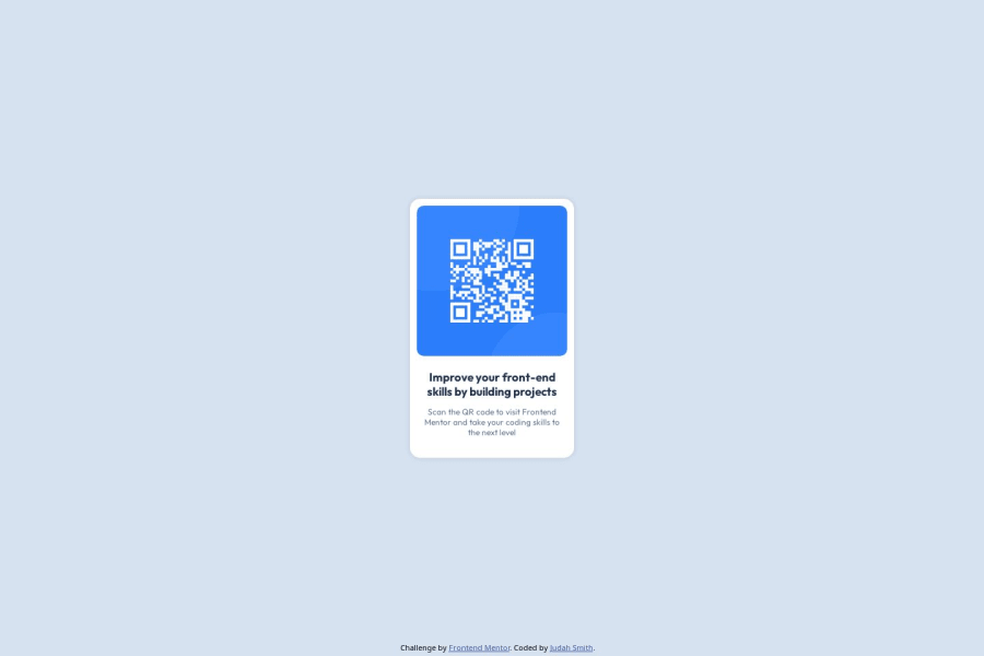
Design comparison
SolutionDesign
Solution retrospective
What are you most proud of, and what would you do differently next time?
I'm most proud of how I got my website to look so close to the given design.
What challenges did you encounter, and how did you overcome them?I didn't know how to center a div, so I looked it up.
What specific areas of your project would you like help with?I would like help with proper HTML and CSS coding habits for writing better code.
Community feedback
- P@TranDanh1122Posted 3 months ago
that good go start something, but we can improve it:
- h1 element is "improve front end...", that MUST NOT hidden, beucause SEO rule.
- when you have a line of text, use span, not p
- font need to linked before link stylesheet file
- you need html reset * {margin 0 padding 0 box-sizing border box}, that will help you have full control spacing
- try to use %, rem, vw, not px, because very hard to change when you need responsive text or people change size of text in their phone (you can try it on your real phone, and see why im recommend use rem)
- need :root to declare all color as variable, dont use color code all around you code, very hard to manage in real life project
Hope that helpful!!!!!
Marked as helpful1
Please log in to post a comment
Log in with GitHubJoin our Discord community
Join thousands of Frontend Mentor community members taking the challenges, sharing resources, helping each other, and chatting about all things front-end!
Join our Discord
