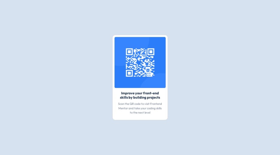
Design comparison
SolutionDesign
Community feedback
- @Theosaurus-RexPosted 10 months ago
Hey @FatehaRsd, great work on your solution! A couple of small suggestions:
- The alt text for the QR code image you have currently isn't descriptive, and since the QR code is not purely decorative I would recommend giving it some descriptive alt text to make it more accessible for screen readers and other assistive technologies
- On my screen, the card itself it a bit off-center, so you may want to check how it looks on a range of different screen sizes (my monitor may have a larger viewport than some, and other folks may have even bigger). Here is a pic of how it looks on my monitor which gives you an idea of what to look out for.
Other than that, fantastic work! Hope this helps 😄
Marked as helpful0
Please log in to post a comment
Log in with GitHubJoin our Discord community
Join thousands of Frontend Mentor community members taking the challenges, sharing resources, helping each other, and chatting about all things front-end!
Join our Discord
