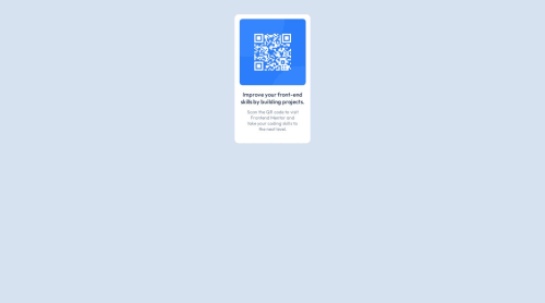
Design comparison
Solution retrospective
I would like to use flexbox property the next time I recreate this project and I would like to make it interactive instead of just being static.
What challenges did you encounter, and how did you overcome them?I encountered a bit of challenge in aligning the content but that was countered with a bit of revision of the topics needed.
Community feedback
- @danielmrz-devPosted 8 months ago
Hey @Shajal-Kumar!
Your solution is really impressive!
I've got a couple of ideas (about how to use HTML better) that could make it even stronger:
š First: Think about using
<main>
to wrap your main content instead of<div>
.Imagine
<div>
and<span>
in HTML as basic containers. They're good for holding stuff, but they don't tell us much about what's inside or its purpose on the webpage.š Second: Consider using
<h1>
for your main title instead of<div>
.It's more than just text size ā it's about structuring your content effectively:
- The
<h1>
to<h6>
tags are used to define HTML headings. <h1>
is for the most important heading.<h6>
is for the least important heading.- Stick to just one
<h1>
per page ā it should be the main title for the whole page. - And don't skip heading levels ā start with
<h1>
, then use<h2>
, and so on.
These tweaks might not change how your page looks, but they'll make your HTML code clearer and help with SEO and accessibility.
Hope that's helpful!
Keep up the great work!
Marked as helpful1@Shajal-KumarPosted 8 months agoThank You @danielmrz-dev. I'll keep these points in mind for my next challenges and will try to redesign this one.
1 - The
Please log in to post a comment
Log in with GitHubJoin our Discord community
Join thousands of Frontend Mentor community members taking the challenges, sharing resources, helping each other, and chatting about all things front-end!
Join our Discord