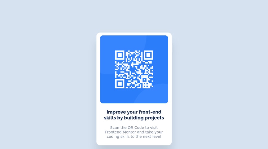
Design comparison
Community feedback
- @rsrclabPosted about 3 years ago
Hi, @RaiIsNotYourGuy ~
Congratulate on your solution to the challenge on FM platform. I have studied your work carefully and learned a lot from it.
Here are some of the tips I like to provide.
- Please try BEM for naming element classes. It will help you a lot on bigger projects.
- Card goes over screen on small devices. Using max-width: 100% will solve this issue.
If it can help you even a bit, it would be happy to me.
Cheers ~
Marked as helpful0@RaiIsNotYourGuyPosted about 3 years ago@tymren608 Thanks for the taking the time and reviewing my submission.
I have added a @media to help fix the issue on small device screens, so it should solve the issue of not resizing.
For BEM, is there a good resource for me to study it? I am not really familiar with the concept.
0@rsrclabPosted about 3 years ago@RaiIsNotYourGuy ~
http://getbem.com/introduction/
Try this one.
0
Please log in to post a comment
Log in with GitHubJoin our Discord community
Join thousands of Frontend Mentor community members taking the challenges, sharing resources, helping each other, and chatting about all things front-end!
Join our Discord
