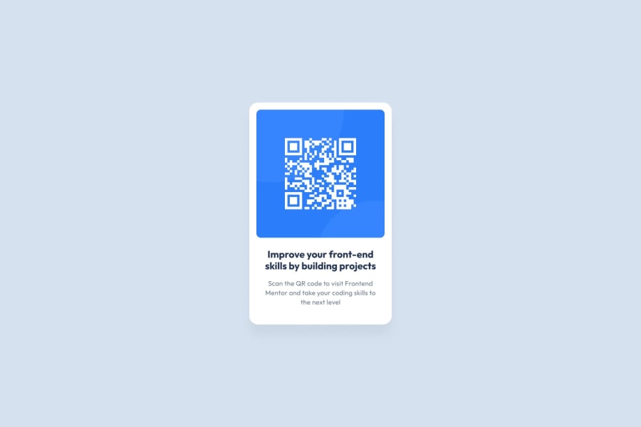
Design comparison
Community feedback
- @scoboxPosted 5 months ago
Size of the card is not as per design, should be 320px, used 230px instead. Class ".master" is not informative, I would rather used class ".card". Title and text (on the card) preferable to be put into <h2>(or <h3>) and <p> tags instead of just <div>'s.
1@mary-rschPosted 5 months ago@scobox
Ty for the feedback!
For the size of the card, i took liberty to adjust it as i pleased, testing out in 3 different navigators (Opera, MEdge and Firefox) and it turned out good in my perseption. (note that i utilized
remunits instead ofpxto ensure that the page is more responsive. This allows the design to scale proportionally based on the root font size, enhancing both accessibility and usability across different devices and user settings.)Now that i think about it, i should really change the
.masterfor.card, it really improves the readbility.As in for
<h1-h6>and<p>, they're not really necessary when it comes to styling, only for formal texts, such as books or news. Although, i should've used<span>, which is the same as<div>, except that it is used for texts. In my code, i utilizeflexfor the formatation, which is good practice.0
Please log in to post a comment
Log in with GitHubJoin our Discord community
Join thousands of Frontend Mentor community members taking the challenges, sharing resources, helping each other, and chatting about all things front-end!
Join our Discord
