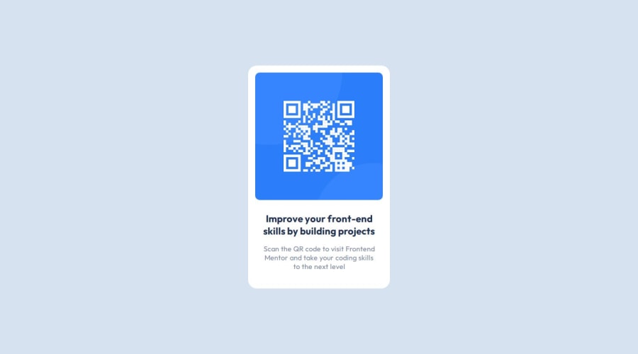
Design comparison
Solution retrospective
I am proud of that I accomplished this task very quickly and practised my box model knowledge also I could use css custom properties. I want to use scss and bem next time.
What challenges did you encounter, and how did you overcome them?In this chellenge I struggled with centering the text especially paragraph However, figma helped me to figure out how much padding and margin to set. In addition, I used flexbox to center the div for the first time it didn't work but I googled a little bit and discovered about min-heght should be set to center vertically otherwise it doesn't work.
What specific areas of your project would you like help with?I completed this task quickly and design matched, although, I am having issue with responsivnes in small sizes. Could you help me if it is possible. Thanks
Community feedback
Please log in to post a comment
Log in with GitHubJoin our Discord community
Join thousands of Frontend Mentor community members taking the challenges, sharing resources, helping each other, and chatting about all things front-end!
Join our Discord
