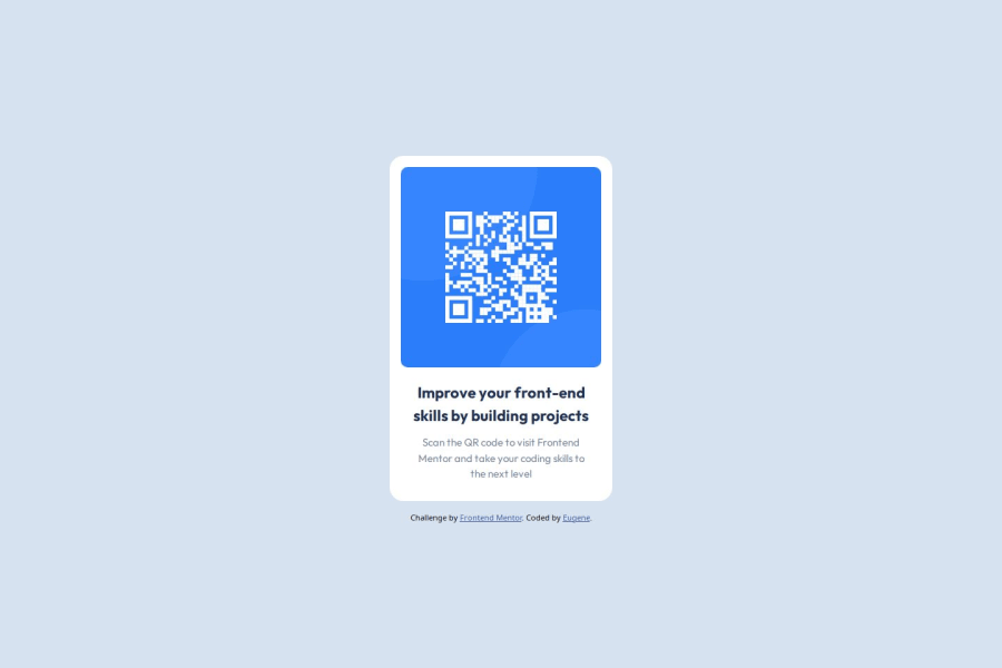
Design comparison
SolutionDesign
Solution retrospective
What are you most proud of, and what would you do differently next time?
I am proud of my usage of the BEM in my CSS as it structures everything cleanly. Next time, I want to try to use CSS Sass, so I can remove some redundant code.
What challenges did you encounter, and how did you overcome them?One challenge I encountered was moving the image to the center of the card. I overcame it by using padding on the card.
What specific areas of your project would you like help with?- I would like to know if my usage of the HTML5 semantic is used correctly.
- I would like to know if my QR code component is responsive.
- I would like to know if using REM (instead of REM) through my CSS is a good idea. If it is not, what parts of my design require the px instead of REM? 3A. When is using PX better than using REM (in general and in the case of the QR Code)?
- Am I using the BEM structure right?
Community feedback
- @grace-snowPosted 7 months ago
This is a really nice solution. I only have a few small tweaks to suggest:
- Give the body a little padding or the component a little margin on all sides so it can't hit screen edges as it's doing now.
- The alt text can be shorter. "QR code to FrontendMentor.io" is fine. I wouldmt say "that links to" as that implies you've wrapped it in a link.
- You don't need to import the font twice. Just choose the specific fonts and weights you want and include that one snippet Google fonts provides. You never need to include the preconnect fonts twice in particular.
- Personally I wouldnt use article for this. It's fine to do if you want but there's no benefit to doing it and I'm not sure this is really what article was intended for. The card definitely shouldn't have a section element inside it. You could make this whole card a section if you wanted but not it's inner parts. Again there would be no actual benefit to making it a section except perhaps making the code slightly easier to read/understand as a card is mentally a "section" of content when we look at a design.
Marked as helpful1@grace-snowPosted 7 months agoOh and answers to your questions:
- Already answered
- Looks fine, just needs that space outside it on small screens.
- You will develop your own instincts and preferences about units over time. The important thing to understand is what the implications are of using each. So you'd only ever want to use pixels when you know something always needs to be a fixed size no matter what the end user's default text size settings are. You want something that never changes - perhaps a border width or image size or min-width/clamp value. Rem on the other hand is what you'll use most of the time because most things we would want to scale along with those text size settings. Em would only be for instances where you want somethings value to relate to the current font size on that element. So perhaps padding on a button or margin-top on paragraphs/headings in a blog article.
- BEM looks fine.
Marked as helpful1@EugeneVuongPosted 7 months ago@grace-snow Thank you so much Grace. Your input is valuable to my improvement in HTML and CSS. :)
0
Please log in to post a comment
Log in with GitHubJoin our Discord community
Join thousands of Frontend Mentor community members taking the challenges, sharing resources, helping each other, and chatting about all things front-end!
Join our Discord
