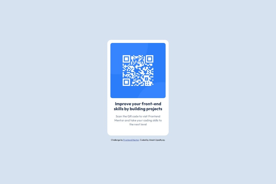
QR code component using basics of CSS Grid and Flexbox
Design comparison
Community feedback
- @StroudyPosted about 2 months ago
Exceptional work! You’re showing great skill here. I’ve got a couple of minor suggestions that could make this stand out even more…
-
Using a full modern CSS reset is beneficial because it removes default browser styling, creating a consistent starting point for your design across all browsers. It helps avoid unexpected layout issues and makes your styles more predictable, ensuring a uniform appearance on different devices and platforms, check out this site for a Full modern reset
-
Height should be set my the elements inside the container, For responsiveness try using
min-heightinstead of just height andmax-width
height: 499px;- For future project, You could download and host your own fonts using
@font-faceimproves website performance by reducing external requests, provides more control over font usage, ensures consistency across browsers, enhances offline availability, and avoids potential issues if third-party font services become unavailable. Place to get .woff2 fonts
I hope you’re finding this guidance useful! Keep refining your skills and tackling new challenges with confidence. You’re making great progress—stay motivated and keep coding with enthusiasm! 💻
Marked as helpful1 -
Please log in to post a comment
Log in with GitHubJoin our Discord community
Join thousands of Frontend Mentor community members taking the challenges, sharing resources, helping each other, and chatting about all things front-end!
Join our Discord
