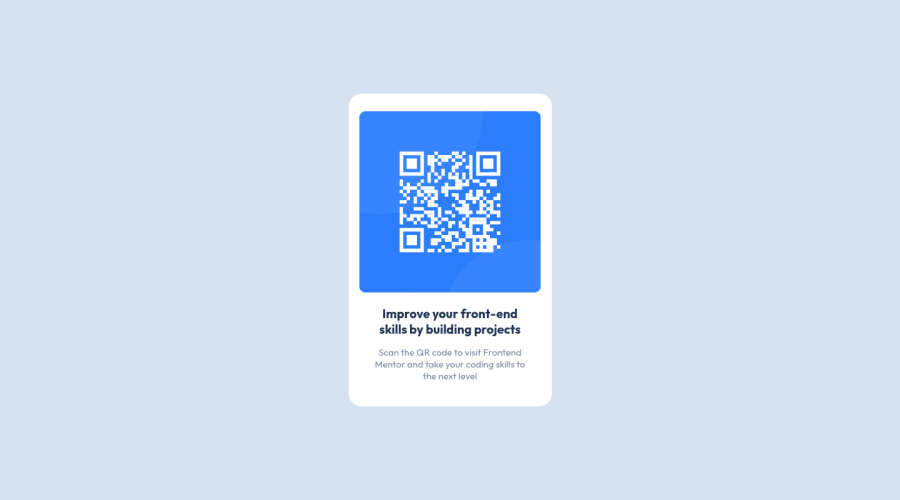
QR code Component using basic HTML, CSS, and flexbox
Design comparison
Solution retrospective
-
I would like to know if my project is in-line with the best practices (E.g. CSS class naming convention, file structure, readme, etc)
-
I would like to know if any features could be added, I have few in my mind like generating custom QR code whenever a user enters their own website, but I'm open to any suggestions :).
Community feedback
- @ToHXPosted almost 3 years ago
Hi there 👋
Some issues I saw
- your CSS class naming could be improved with BEM
- Your img has no alt Attribute
- You have a h3 but no h1
- Font size always in rem
Marked as helpful2Account deleted@ToHX you mean , using rem is better practice for fonts
0 - @kacperkwintaPosted almost 3 years ago
Hi!
Some tips for fixing errors in your solution report:
- add
alt=""tag to image - create
<main>tag and wrap all other elements into this
Marked as helpful0 - add
- @cloudyayPosted almost 3 years ago
Hi Harish
The solution looks great. There is something I would like to know. How were you able to create the white box of almost the same dimensions? Is there a way to figure out what should be the width and height size?
Thanks, Megha
0@hpsettiPosted almost 3 years ago@cloudyay
Hey Megha,
I use a tool called "preview" wherein I just highlight the component that I want to measure. I think it's a macOS exclusive app, but I'm sure Windows has better apps to do the same :)
Harish
0
Please log in to post a comment
Log in with GitHubJoin our Discord community
Join thousands of Frontend Mentor community members taking the challenges, sharing resources, helping each other, and chatting about all things front-end!
Join our Discord
