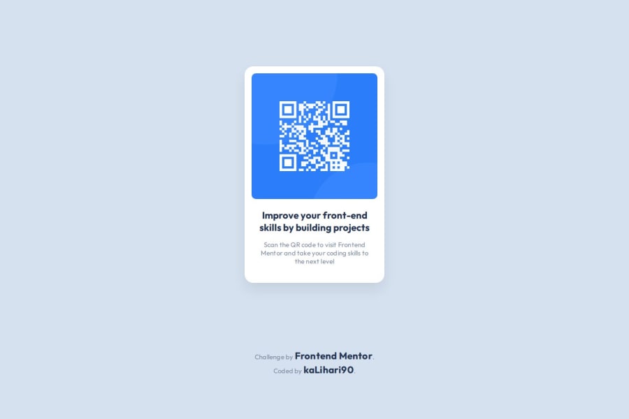
Design comparison
Solution retrospective
I'm proud it was easy challenge and I didn't have any problems with working on the Figma file. I also wrote the readme.md file for the first time. I tried to be pixel perfect and I'm very close to achieve that.
What challenges did you encounter, and how did you overcome them?I didn't remember how to upload project to GitHub, but after recalling one video from the course (MMC School - Kurs Tworzenia Stron WWW cz.3) I've done it easily. I wanted to make one repository with multiple projects, but after short research I've decided it's too hard and i don't want confilcts in my GitHub, so maybe I will try it later in the future after gaining more experience, especially with Git. In my first solution spacing above the text wasn't perfect. I adjusted it by adding margin-top to the title and a little more line-hight and also letter spacing to the paragraph. I also changed class names to use BEM system.
What specific areas of your project would you like help with?I don't know what can I do more to make my solution better. Let's jump to the next one.
Community feedback
Please log in to post a comment
Log in with GitHubJoin our Discord community
Join thousands of Frontend Mentor community members taking the challenges, sharing resources, helping each other, and chatting about all things front-end!
Join our Discord
