Design comparison
SolutionDesign
Community feedback
- @Nikhila-DNPosted 4 months ago
Hi @ChrisRoland,
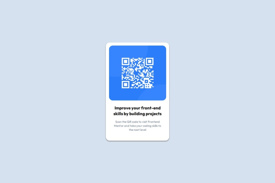
Your solution looks great, and it's similar to the design.
1 - P@jedcancholaPosted 5 months ago
Good usage of main section. Need usage of semantic html tags as article, for the card. There is no alt text for the qr image. The code looks good in different screen sizes, The solution differs slightly from the original but it is a good solution.
1
Please log in to post a comment
Log in with GitHubJoin our Discord community
Join thousands of Frontend Mentor community members taking the challenges, sharing resources, helping each other, and chatting about all things front-end!
Join our Discord
