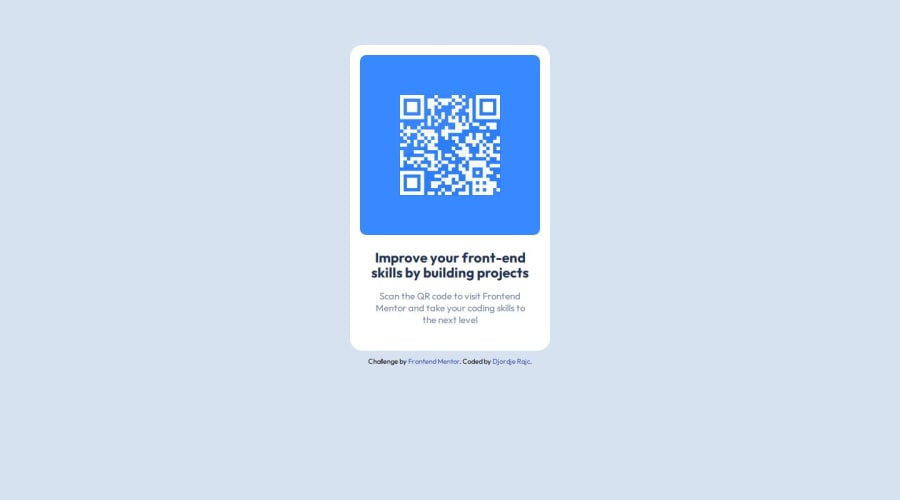
Design comparison
Solution retrospective
This is my first time using Figma Design, so I had a few problems positioning the component in the center of the webpage. So I decided to use display flex and margin to place it in the center.
What challenges did you encounter, and how did you overcome them?I had a few problems of course but one problem that stuck out was with the image. I noticed that the image had a background with some circles but the Figma design didn't so I tried different ways to cut it out or mask it. I decided to use clip-path to cut the sides of the image just enough so you can see the whole QR code and then changed background color of container__image class to match QR code image color.
What specific areas of your project would you like help with?Is using a margin and display: flex to center a div element in HTML page best practice or is there something else I could have done? Is there any elegant solution to remove image background than clip-path?
Community feedback
Please log in to post a comment
Log in with GitHubJoin our Discord community
Join thousands of Frontend Mentor community members taking the challenges, sharing resources, helping each other, and chatting about all things front-end!
Join our Discord
