Submitted over 1 year ago
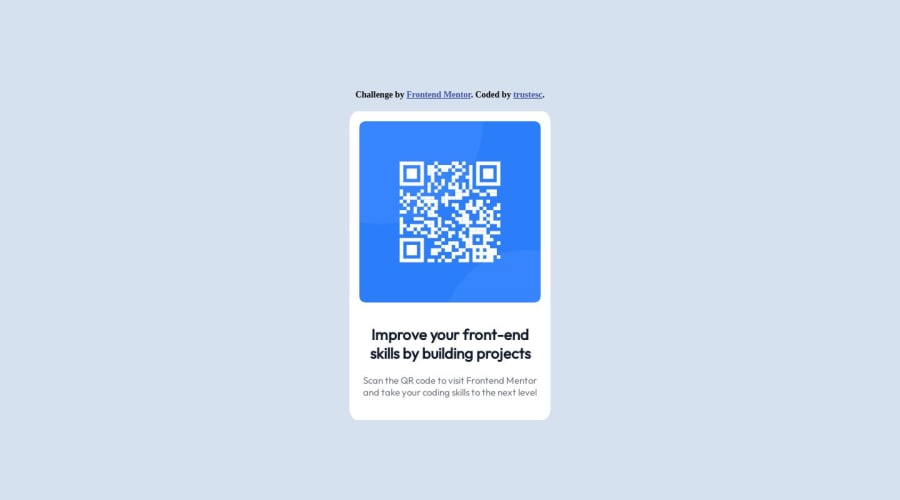
QR code component {tools:"Figma", tech:"root flexbox var @media"}
@trustesc
Design comparison
SolutionDesign
Community feedback
- @AkinGabsPosted over 1 year ago
Nice work it looks good on my smart phone. Try to put a little more margin to the p tag.
0@trustescPosted over 1 year ago@AkinGabs
Thank you for your comment. Honestly I don't understand why the p tag is that close to the bottom. If I test my files directly in Chrome or Firefox I always have enough spacing (just like in the provided templates).
0
Please log in to post a comment
Log in with GitHubJoin our Discord community
Join thousands of Frontend Mentor community members taking the challenges, sharing resources, helping each other, and chatting about all things front-end!
Join our Discord
