

Design comparison

Solution retrospective
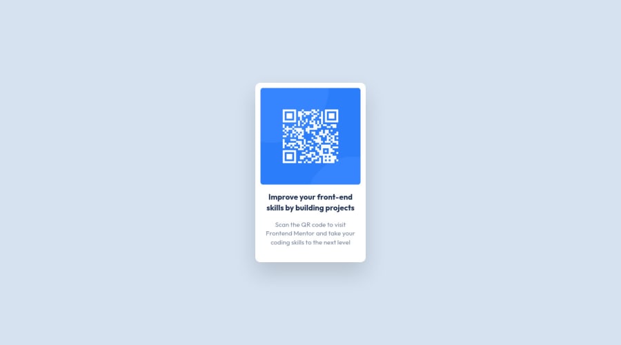
When sizing the QR code image, I used a pretty tacky solution:
<img
  src="./images/image-qr-code.png"
  class="border-separate rounded-md w-64 h-[14rem]"
>
I tried using h-64 to match the width, but the image ended up being a little too tall. Is there a different code implementation such that it clearly expresses that the image size should be a square?
Community feedback
- @leonpaholePosted over 1 year ago
Hey hey Stephen :) I wanted to answer your question regarding why the image was not square.
First of all, if you set w-64 and h-64 (that is, same width and height) on the image, it should cause it to be square, unless some other declaration is preventing it from being square. In your case, if we set width and height of the image to be 16rem (that's what w-64 and h-64 do), you will notice, that the height will be equal to 16rem (256px), but the width will not be - it will only be 232px. So why is that?
Feel free to inspect your styling and try to figure it out before checking the answer.
So the reason is that your image has a max-width property, which is set to 100%. This means that regardless of what you set as the image width, it's cap (maximum) is 100%. But what is 100%? Well, 100% refers to the available width that it's container gives the element. The container is an article element, which has a padding of 0.75rem and a width of 16rem. This means that the image will get 16rem - 2*0.75rem (accounting for left and right padding) = 14.5 rem - and that's exactly 232px. Thus, the image can have a maximum width of 232px - if you set more, it will be capped at that value.
Now, you could just remove the max-width property on the image, but that will stretch the image past the paddings of the container. Thus, to solve this, you will have to increase the width of the container.
By the way, there is a way to have the image be a perfect square: by using aspect-ratio: 1 in the CSS. But beware that the property has (only) 90% browser support.
However, because the image is naturally a square, there is something else you can do: you can set one of the dimensions and then set the other to auto. This will try to establish an original aspect ratio of the image, which in your case is a square. So what you can do is set the width of the image to 100%, and height to auto. Then set width on the article to whatever you want and you will see that the image will adapt to stay the square regardless of what the width is. This approach is great because if someone modifies the code later to change the width of the container, they only need to change one value (as opposed to changing both the width of the image and the width of the container). If the image wouldn't be a square originally, then as far as I know, the aspect ratio approach would be the only other way to achieve this without hardcoding the image dimensions.
Let me know if my explanation made sense! And good job on completing the challenge! :)
Marked as helpful1 - @0xabdulkhaliqPosted over 1 year ago
Hello there 👋. Congratulations on successfully completing the challenge! 🎉
- I have other recommendations regarding your code that I believe will be of great interest to you.
HTML 🏷️:
- This solution generates accessibility error reports, "All page content should be contained by landmarks" is due to
non-semanticmarkup, which lack landmark for a webpage
- So fix it by replacing the parent
<div>element with the semantic element<main>in yourindex.htmlfile to improve accessibility and organization of your page.
- What is meant by landmark ?, They used to define major sections of your page instead of relying on generic elements like
<div>or<span>
- They convey the structure of your page. For example, the
<main>element should include all content directly related to the page's main idea, so there should only be one per page
iMAGES 📸:
- Since this component involves scanning the QR code, the image is not a decoration, so it must have an
altattribute.
- The
altattribute should explain the purpose of theimage.
- E.g.
alt="QR code to frontendmentor.io"
.
I hope you find this helpful 😄 Above all, the solution you submitted is great !
Happy coding!
1


Please log in to post a comment
Log in with GitHub
Join our Discord community
Join thousands of Frontend Mentor community members taking the challenges, sharing resources, helping each other, and chatting about all things front-end!
Join our Discord