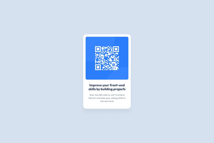
Design comparison
Solution retrospective
Hello, my name is Dean, here is my solution for this challenge.
I built the layout using TailwindCSS.
In order to get a 100% Lighthouse rating, I darkened the text colour for the paragraph to increase the contrast to make it easier to read on the white background.
Thanks for taking a look, any feedback is appreciated.
Community feedback
- @dantheuri17Posted 11 months ago
I actually think that the description text on yours looks better than the design. The increased line height makes the text more readable. Well done.
1@DeanogitPosted 11 months agoThanks for your feedback @dantheuri17,
I adjusted the
hsl(220, 15% 55%)down tohsl(220, 15%, 45%)Nothing too major, the Lighthouse test seemed to like it too :)
1
Please log in to post a comment
Log in with GitHubJoin our Discord community
Join thousands of Frontend Mentor community members taking the challenges, sharing resources, helping each other, and chatting about all things front-end!
Join our Discord
