Not Found
Not Found
Not Found
Not Found
Not Found
Not Found
Not Found
Not Found
Not Found
Not Found
Not Found
Not Found
Not Found
Not Found
Not Found
Not Found
Not Found
Not Found
Not Found
Not Found

Submitted

QR Code Component

thamu-acn 200

@thamu-acn

Desktop design screenshot for the QR code component coding challenge

This is a solution for...

  • HTML
  • CSS
1newbie
View challenge

Design comparison


SolutionDesign

Solution retrospective


What are you most proud of, and what would you do differently next time?

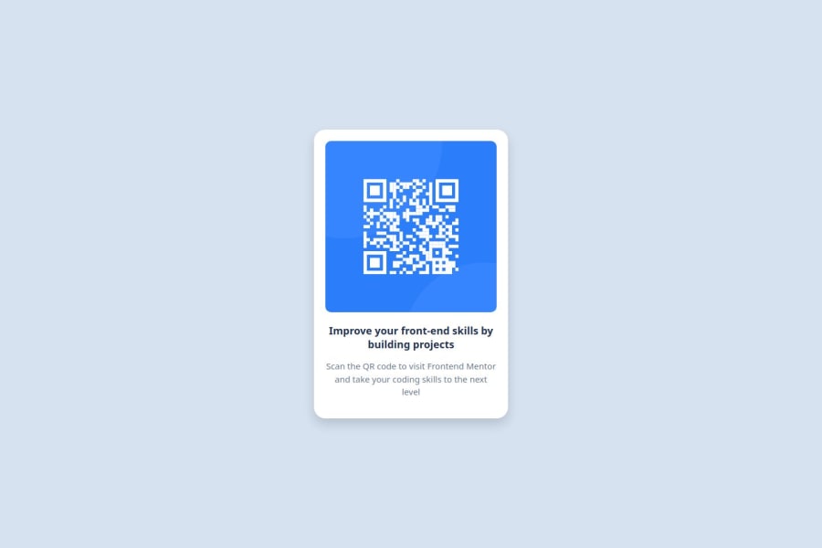
I was able to produce the layout on the design. My page is responsive which makes it adaptable to different screen sizes without distorting content.

What challenges did you encounter, and how did you overcome them?

Initially the image couldn't fit inside the container div until I set max-width to 100%.

What specific areas of your project would you like help with?

I would like to know if it is right to add bootstrap to this project and use the card component to avoid writing many css styles

Community feedback

T

@gmagnenat

Posted

Hi, congrats on completing the project.

I’ve reviewed your code and have a few suggestions to help you improve it:

Accessibility and Structure:

  • Main Landmark: The <main> element should be the parent of your card, not the card itself. Also, you don’t need to add role="main" to the <main> element as it is already recognized as the main content landmark.

  • Alt Attribute: Avoid using "image" in the alt attribute of your images. Instead, describe what the image represents or its function. This makes it easier for users with screen readers to understand the content.

CSS and Layout:

  • Use a CSS Reset: Your stylesheet should include a modern CSS reset at the beginning. This helps ensure that your design looks consistent across different browsers.

  • Min-Height on Body: Instead of using a fixed height for the body, use min-height. This allows the body to expand with the content and provides a better experience as content grows.

  • Font Sizes in Pixels: Never use pixels for font sizes. Use relative units like rem or em to ensure that text scales properly with user settings and devices.

Maintainability:

  • Use Classes for Styling: Rather than styling HTML elements directly, use classes. This makes your code more maintainable and flexible. For example, use a class like .heading instead of styling h1 directly. This way, if you decide to change the HTML tag, you won’t need to update your CSS selectors.

I hope these tips help you improve your project. If you have any questions or need more details, just let me know!

Happy coding!

1

@RogerTito455

Posted

From my point of view I think that the code is well-structured, readble and reusable since you have used all of the correct components of css. However I think that there are other ways of making that but I think that the code is similar of the example. Well Job!

0

Please log in to post a comment

Log in with GitHub
Discord logo

Join our Discord community

Join thousands of Frontend Mentor community members taking the challenges, sharing resources, helping each other, and chatting about all things front-end!

Join our Discord