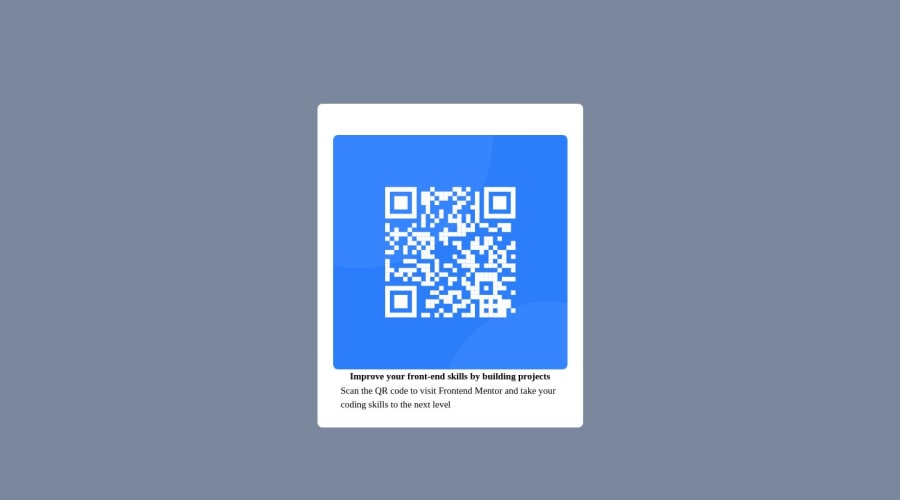
Design comparison
Solution retrospective
Hi , I have tried to use flexbox and im getting similar result as desired on desktop view but on mobile design i couldnt figure out exactly.My card fills all screen horizontally. Any feedback is appreciated. Thanks
Community feedback
- @Faraz74MughalPosted over 1 year ago
Hello there 👋. Congratulations on successfully completing the challenge! 🎉
I have other recommendations regarding your code that I believe will be of great interest to you. HEADINGS ⚠️:
This solution consists incorrect usage of <h3> so it can cause severe accessibility errors due to incorrect usage of level-three headings <h3> Every site must want only one h1 element identifying and describing the main content of the page. An h1 heading provides an important navigation point for users of assistive technologies, allowing them to easily find the main content of the page. In this solution there's <h3> element which is this <h3>Improve your...</h3>, you can preferably use <h1> instead of <h3>. Remember <h1> provides an important navigation point for users of assistive technologies so we want to use it wisely So we want to add a level-one heading to improve accessibility Example: <h1>Improve your front-end skills by building projects</h1> If you have any questions or need further clarification, and feel free to reach out to me. If you have any questions or need further clarification, you can always check out my submission and/or feel free to reach out to me. .
I hope you find this helpful 😄 Above all, the solution you submitted is great !
Happy coding!
Marked as helpful0
Please log in to post a comment
Log in with GitHubJoin our Discord community
Join thousands of Frontend Mentor community members taking the challenges, sharing resources, helping each other, and chatting about all things front-end!
Join our Discord
