Design comparison
Solution retrospective
I just started the responsive design part, it may be a little incomplete here.
Community feedback
- @Nadine-GreenPosted almost 2 years ago
HEY ERAY
Congratulations on completing your first challenge
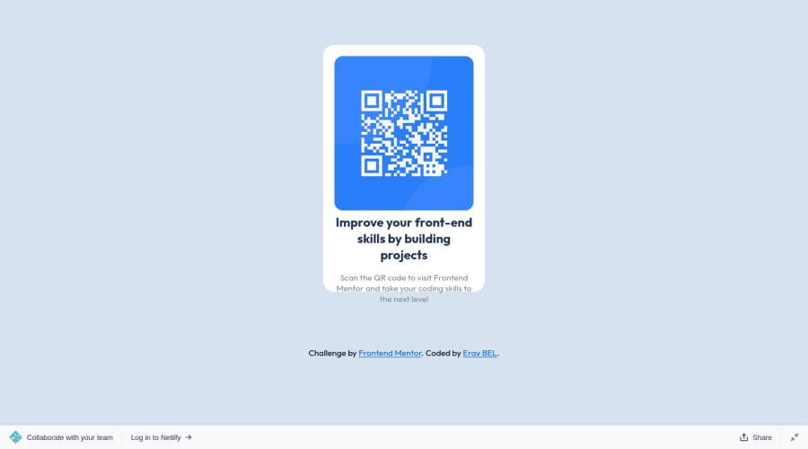
I would like to point out something which I noticed, you will need to increase the height of your container because I see that its contents are spilling out, instead of using vh, try using rems, it is also a lot more responsive.
IF YOU HELPED YOU IN ANY WAY, DON'T HESITATE TO MARK IT AS HELPFUL :)
HAPPY CODING!
Marked as helpful0 - @HassiaiPosted almost 2 years ago
Replace <div class="container"> with the main tag and <div class="attribution"> with the footer tag to fix the accessibility issues. To center a content on a page, add min-height:100vh; display: flex; align-items-center: justify-content: center; to the body. Instead of giving .container a margin value
Give .content-area a padding top and bottom value.
Hope am helpful
Well done for completing this challenge, you did a good job, Happy Coding.
Marked as helpful0
Please log in to post a comment
Log in with GitHubJoin our Discord community
Join thousands of Frontend Mentor community members taking the challenges, sharing resources, helping each other, and chatting about all things front-end!
Join our Discord
