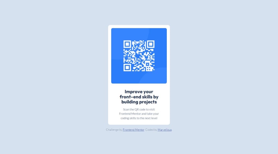
Design comparison
Solution retrospective
I wrote all the code personally, there was no Ctrl + C and Ctrl +V
What challenges did you encounter, and how did you overcome them?Font integration to CSS file With help from google fonts I got a code snippet
What specific areas of your project would you like help with?None
Community feedback
- @Islandstone89Posted 6 months ago
HTML:
-
I would have a
<div class="card">inside of the<main>, since a card would likely not be the only main content on a page. -
The alt text should be written naturally, without using
-between the words. The alt text must also say where it leads(frontendmentor website). A good alt text would be "QR code leading to the Frontend Mentor website." -
I would remove
.footnote, as that text is already in the card. -
.attributionshould be a<footer>, and you should use<p>for the text inside.
CSS:
-
Including a CSS Reset at the top is good practice.
-
I like to add
1remofpaddingon thebody, to ensure the card doesn't touch the edges on small screens. -
On
body, removemarginandwidth- it is a block element, meaning it takes up the full width by default. Changeheighttomin-height- this way, the content will not get cut off if it grows beneath the viewport. -
Remove all widths and heights.
-
Add a
max-widthof around20remon the card, to prevent it from getting too wide on larger screens. -
font-sizemust never be in px. This is a big accessibility issue, as it prevents the font size from scaling with the user's default setting in the browser. Use rem instead. -
Paragraphs have a default value of
font-weight: 400, so there is no need to declare it. -
Since all of the text should be centered, you only need to set
text-align: centeron the body, and remove it elsewhere. The children will inherit the value. -
Remove
font-style: normal, as that is the default value. -
On the image, add
display: blockandmax-width: 100%- the max-width prevents it from overflowing its container.
Marked as helpful1@Marvie-03Posted 6 months ago@Islandstone89 Thanks for this comment, I have implemented every suggestion. And it's better and well constructed.
1@Islandstone89Posted 6 months ago@Marvie-03 well done!
A few things to notice:
-
Remember to change
font-sizefrompxto rem on<p>. -
Remove
max-heighton the card. -
Add
min-height: 100svhonbody.
Marked as helpful0@Marvie-03Posted 6 months ago@Islandstone89 Thanks once again! Made the changes you recommended.
I haven't seen the
*svhunit before now, I looked it up .1 -
- @JacobKnittlePosted 6 months ago
Looks good just needs to touching up on the margin and padding specifically with the text.
0
Please log in to post a comment
Log in with GitHubJoin our Discord community
Join thousands of Frontend Mentor community members taking the challenges, sharing resources, helping each other, and chatting about all things front-end!
Join our Discord
