Not Found
Not Found
Not Found
Not Found
Not Found
Not Found
Not Found
Not Found
Not Found
Not Found
Not Found
Not Found
Not Found
Not Found
Not Found
Not Found
Not Found
Not Found
Not Found
Not Found

Submitted

QR code component solution with basic HTML/CSS

Eneyee 60

@Eneyee

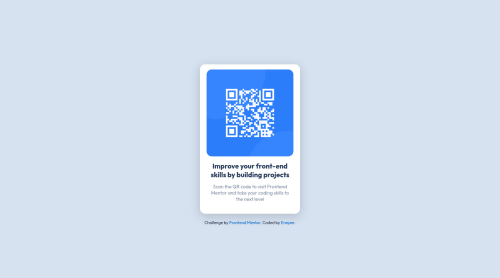
Desktop design screenshot for the QR code component coding challenge

This is a solution for...

  • HTML
  • CSS
1newbie
View challenge

Design comparison


SolutionDesign

Solution retrospective


  • How much of the code is usless or repeats what was already stated earlier?
  • How to aproach positioning of the elements better?
  • Please recomend some resourses for learning front-end for an abslute beginner and maybe provide a general roadmap of front-end developer

Community feedback

@Jbugglin

Posted

In your index.html file, the main tag within the body should utilize the h1 tag instead of <div class = "title">, which would do away with the level 1 heading error. Just as a quick suggestion, lookup semantic HTML5, there are updated element tags that do away with the use of utilizing <div> tags for headings, paragraphs, articles, asides, etc. A website that I used when learning this: https://www.w3schools.com/html/html5_semantic_elements.asp

The alternate text error regarding the QR code image is an accessibility issue, where if the image can't load or if the user is utilizing a screen reader, it will read that alt text, all that needs to be done with that is just adding the alt="" attribute in the <img> tag along with a quick summary of the image.

As for the landmarks warning, the attribution div at the end of the index.html file should be changed to the footer element to be semantically correct for html5. I think it's a bit odd that they would include code in the startup file that throws warnings.

As for the styling side of your project, the one thing that jumps out at me just looking at the preview is the border radius of the QR code image, looks a bit off. I try to match whatever the main card's border radius is and halve it. That way the rounded corners look a bit closer to the given sample. So for the main card you have a border radius of 15px, if you gave the image a radius of 7.5px, the corners look a bit more nestled in and the spacing around more uniform. Also, do not need to specify in the image to display as block, instead try to give it a width and height of 100%. That will make it "fill" the area in your main card element. To make it more responsive, look into using rem/em units in place of pixels. This resource kinda helped me when I started out trying to produce more responsive css: https://www.w3docs.com/snippets/css/which-is-better-to-use-in-css-px-em-or-rem.html

You could take the margin: 0; and padding: 0; for the body and main and add them as a reset at the beginning of the styling file as a reset such as: body, main, h1, p {margin: 0; padding: 0; } . Since you already have display: flex; in the body and have it justified and aligned to center, you don't really need the position: absolute; in the main as well as setting the margin to auto since that already takes care of it for you. Position absolute only works in a child element if you specify a position relative in the parent element. Also, you can drop the display block in the main element. Some CSS resources to help learn more that I would recommend would be to check out the front end development course for freecodecamp.org or check out the Odin project, there is also tons of great resources on Youtube (i.e.: Kevin Powell's channel)

I know this is a pretty lengthy post, but I implore you to continue on and keep learning, you're doing great!

Marked as helpful

1

Eneyee 60

@Eneyee

Posted

@Jbugglin Thank you for your detailed feedback and the resourses you've provided, I will update my project based on your comment

0
Kerby 200

@KeremBakan

Posted

Your <img> tags should have alt attribute.

The alt attribute should explain the purpose of the image. Uppon scanning the QR code, the user will be redirected to the frontendmentor.io website, so a better alt attribute would be QR code to frontendmentor.io.

If you want to learn more about the alt attribute, you can read this article 📘.

Every page should have <h1> tag because it is important for screen readers. If you want to add <h1> tag but making it only visible for screen readers, you can use something like this.

 .sr-only {
        position: absolute;
        width: 1px;
        height: 1px;
        padding: 0;
        margin: -1px;
        overflow: hidden;
        clip: rect(0, 0, 0, 0);
        border: 0;
      }

Your page should have <footer> tag.

You can use reset.css or normalize.css to reset default styling.

Happy Coding 😁

Marked as helpful

1

Eneyee 60

@Eneyee

Posted

@KeremBakan Thank you for your feedback, I will implement the changes you suggested into my project.

0

Please log in to post a comment

Log in with GitHub
Discord logo

Join our Discord community

Join thousands of Frontend Mentor community members taking the challenges, sharing resources, helping each other, and chatting about all things front-end!

Join our Discord