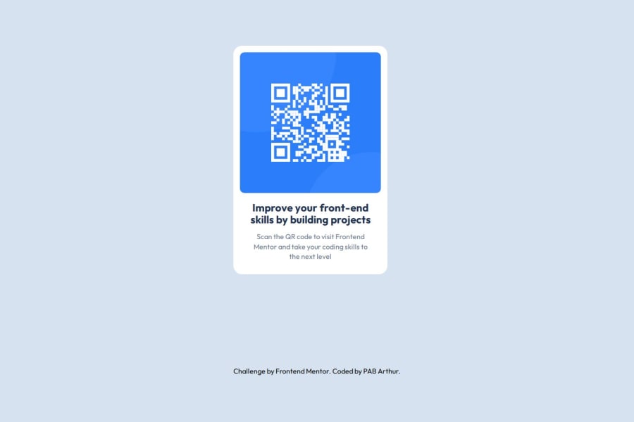


Design comparison

Solution retrospective
I am most proud of effectively utilizing the grid layout to organize and display content seamlessly.
What challenges did you encounter, and how did you overcome them?The main challenge I encountered was managing media queries to ensure the design remained responsive across different devices and screen sizes.
What specific areas of your project would you like help with?I would like help with fine-tuning my media queries to ensure my design remains responsive across various devices and screen sizes
Community feedback
- @gmagnenatPosted about 2 months ago
Hi, great job on your project! Here are some key areas where you can improve accessibility, maintainability, and best practices.
Semantic HTML & Accessibility
- Missing
<main>landmark: This is essential for screen reader users to navigate the primary content of the page. Wrap your component inside<main>. - Avoid unnecessary
<section>elements: Since this is a single component rather than a distinct section of a document, a simple<div>with a class is more appropriate. - Heading level should be
<h2>: As this component is part of a larger page, an<h1>would be used for the main page title, and this should be a subheading. - Missing
alttext for images: Without analtattribute, screen readers will ignore the image. Ensure all meaningful images have descriptive alt text.
CSS Best Practices
- Use a modern CSS reset: A reset (like Andy Bell’s or Josh Comeau’s) ensures better consistency across browsers and should be included at the top of your stylesheet.
- Avoid styling HTML elements directly (e.g., p, h1, section): Instead, use classes. Styling elements directly makes it harder to maintain and update your CSS if the HTML structure changes. Adding classes keeps the styles modular and reusable.
- Use
reminstead of pixels (px) formax-widthof your card: This makes your layout more flexible and accessible for users who adjust their browser’s default font size. - Avoid fixed
max-widthon images: Modern CSS resets typically includeimg { max-width: 100% }, so you don’t need to redefine this unless necessary.
These improvements will make your project more accessible and maintainable.
Keep up the great work, and happy coding! 🚀
Let me know if you need further clarification.
Marked as helpful1@pabjuniorPosted about 2 months ago@gmagnenat thank you very much, I needed this...I will update it soon
0 - Missing
- P@MarceloColodettiPosted about 2 months ago
The solution appears to be a different size than the presented design, but other than that, it's great!
Marked as helpful0@pabjuniorPosted about 2 months ago@MarceloColodetti thank you, I will update it soon to fit the size as it is
0


Please log in to post a comment
Log in with GitHub
Join our Discord community
Join thousands of Frontend Mentor community members taking the challenges, sharing resources, helping each other, and chatting about all things front-end!
Join our Discord
