Design comparison
Solution retrospective
This is the first challenge I work in, any feedback would be welcomed.
Community feedback
- P@nikoescobalPosted over 2 years ago
Hello there! 👋
Congratulations on finishing your challenge! 🎉
Here's some feedback on this solution:
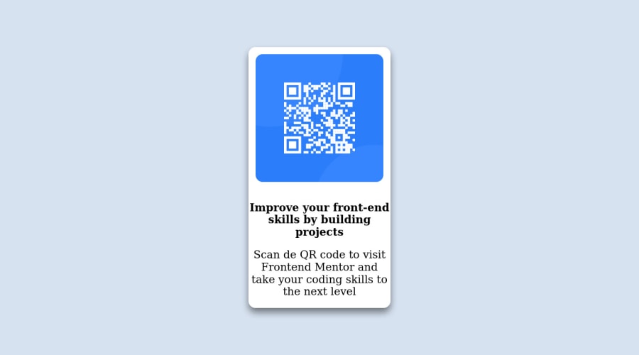
- You should build mobile-first, meaning all your CSS classes should apply to the mobile viewport first, then add media queries to manage the other screen sizes
- It seems like you didn't resize the fonts for mobile view
- Add padding to the text so it doesn't touch the sides of the card.
- Check the report to fix accessibility issues - you currently have 1 listed
I hope this is helpful and all the best with your coding journey!
Marked as helpful1@AgusSaMacPosted over 2 years ago@nikoescobal Hello, thank you very much for your feedback. I'll apply the changes and have your advice in mind for future projects.
Have a great day!
1P@nikoescobalPosted over 2 years ago@AgusSaMac Awesome to hear! It's my pleasure! Hope you have a great day as well! Oh, one last thing -- I highly recommend learning Sass, as this will allow you to nest your CSS classes and keep your code much cleaner/more readable. It's also good because it allows you to mimic the HTML structure in a way that makes it easy to follow/read your code overall.
Cheers, Niko
Marked as helpful1
Please log in to post a comment
Log in with GitHubJoin our Discord community
Join thousands of Frontend Mentor community members taking the challenges, sharing resources, helping each other, and chatting about all things front-end!
Join our Discord
