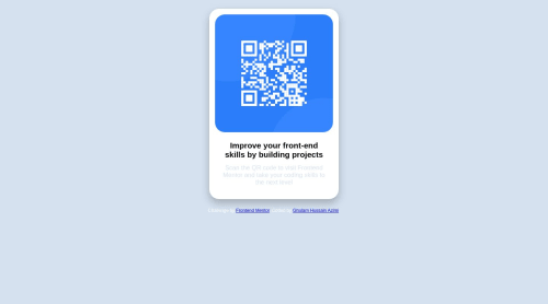
Submitted over 2 years agoA solution to the QR code component challenge
QR code component solution using CSS Flexbox
@HussainAzimi

Solution retrospective
What are you most proud of, and what would you do differently next time?
I am proud that I can learn new things from completing this challenge and I would like to use them in future challenges
What challenges did you encounter, and how did you overcome them?the div position was the challenge I encountered; fortunately, I could overcome it by searching and finding the solution.
What specific areas of your project would you like help with?I need more help in these areas of my code: 1- flexibility 2- clean and light
Code
Loading...
Please log in to post a comment
Log in with GitHubCommunity feedback
No feedback yet. Be the first to give feedback on HussainAzimi's solution.
Join our Discord community
Join thousands of Frontend Mentor community members taking the challenges, sharing resources, helping each other, and chatting about all things front-end!
Join our Discord