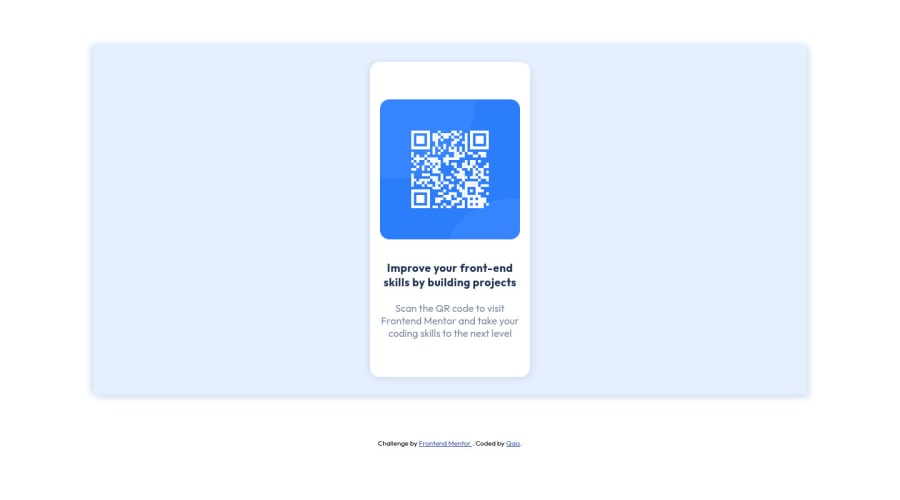
Design comparison
Solution retrospective
Any feedback is appreciated and I am also willing to help if you have any doubts!
Community feedback
- @PhoenixDev22Posted almost 3 years ago
Greeting @wqais ,
I have few suggestions regarding your solution:
-
Use
<main>to wrap the body content (card ) and afooter(which will be the attribution).<Footer>should be outside the`` <main >` . HTML5 landmark elements are used to improve navigation . -
To tackle the accessibility issues : Page should contain a level-one heading , you can add a
<h1>withclass="sr-only"(Hidden visually, but present for assistive tech). -
The markup might look :
<main> <div class=""> <img ...> <p>........</p> <p> ......</p> </div> </main> <footer> attribution </ footer>- To center the card on the middle of the page , you can use the flexbox properties and
min-height: 100vhfor the<body>like this:
body{ display:flex; align-items: center; justify-content: center; width: 100%; min-height: 100vh; flex-direction: column; background-color: hsl(217, 100%, 95%);-
Remove the extra div. card-background
-
You should use
emandremunits .Bothemandremare flexible, Usingpxwon't allow the user to control the font size based on their needs.
You might have a look at my solution, it might helps. .
Overall , your solution is good. Hopefully this feedback helps.
Marked as helpful1@wqaisPosted almost 3 years agoHey @PhoenixDev22,
This was really helpful and cleared several of my doubts, thanks a lot.
I checked your solution, it's really good, well done!
Thanks!
0 -
- @HolllyyyyPosted almost 3 years ago
Hello @wqais, great job, well done! :3 I would recommend you for large screens to use *{paddin n margin 0, box-sizing border box} that will be applied on all ur elements... One tip: try to always make a folder for CSS, and inside that folder to put CSS files, it's much easier for other devs to reading your code. :3
Marked as helpful0@wqaisPosted almost 3 years agoHey @Holllyyyy,
Thank you for the feedback, I'll keep this in mind for my next projects!
0 - @EmmanuelHexerPosted almost 3 years ago
Hello @wqais, I checked your code and fixed somethings for you
-
To fix your design a little bit, reduce the height on
.card-backgroundsection to50vh -
Then add your background color to the body instead of card-background section
-
Then change the margin on the card background to
margin: 0% 10% -
Then add
top: 16rem
I hope i fixed some of the issues with your design.
Marked as helpful0@wqaisPosted almost 3 years agoHi @Phalcin,
Thank you for the feedback, I have fixed the design issues now!
0 -
- Account deleted
Hello there! 👋
Congratulations on finishing your challenge! 🎉
I have some feedback on this solution:
- Always Use Semantic HTML instead of
divlike<main><header><footer>, etc for more info
i hope this is helpful and goodluck!
Marked as helpful0@wqaisPosted almost 3 years agoHey @Old1337,
Thank you for the feedback, I'll keep this in mind for the next challenges!
1 - Always Use Semantic HTML instead of
Please log in to post a comment
Log in with GitHubJoin our Discord community
Join thousands of Frontend Mentor community members taking the challenges, sharing resources, helping each other, and chatting about all things front-end!
Join our Discord
