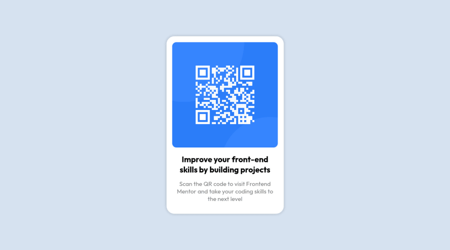
Design comparison
Solution retrospective
Community feedback
- @atif-devPosted almost 2 years ago
Hi Elevate, congrats🎉 on completing the challenge. Better take care about following points.
- To overcome warning: Page should contain a level-one heading. Create level one heading (<h1></h1>) inside
mainand hide it visually. Although it will be hidden on UI but will be readable for screen readers technology. - There are responsiveness issues in your solution. Now a days responsiveness matters a lot. If you don't know much about responsiveness, you can learn from FreeCodeCamp or you can check out this free intro course for getting started in responsiveness.
- Write more in your project's GitHub README file. Like write about working flow, about challenge, your findings, useful resources etc.
Hope you will find this Feedback Helpful.🙂
Marked as helpful2@i7ectorPosted almost 2 years ago@atif-dev thanks for the tip on the level-one heading error however, I'm not sure how I can make it more responsive, from what I can see it looks great on all devices. I usually code mobile first but from desktop screenshot it doesn't look any different on bigger screens. I wish I had the figma design file or something.
1@atif-devPosted almost 2 years ago@i7ector I have checked responsivness by using Google chrome dev tools. But If on your end responsivness is fine then it's OK because sometimes when we check responsiveness on Google chrome dev tools it shows us not right responsiveness whereas our responsiveness is FINE. Just make sure to use Responsively app or LT browser for checking responsiveness.
1 - To overcome warning: Page should contain a level-one heading. Create level one heading (<h1></h1>) inside
- @MelvinAguilarPosted almost 2 years ago
Hello 👋. Congratulation on successfully completing your first challenge 🎉 ! !
I have some suggestions about your code that might interest you.
-
This is not how you should hide an element. You have positioned it behind the component, but there may be situations where the text is visible and can be copied. If you want to visually hide it but keep it accessible to screen readers, use a class "sr-only". You can copy the styles with the following code:
You can create a <h1> and give it a suitable text:
<h1 class="sr-only">QR Card Component</h1>Styles:
.sr-only {
  clip: rect(0 0 0 0);
  clip-path: inset(50%);
  height: 1px;
  overflow: hidden;
  position: absolute;
  white-space: nowrap;
  width: 1px;
}
The
sr-onlyclass is a class that you can add to hide content visually but is only visible to screen-readers.
- For specificity reasons you should work with classes instead of ids because they are more reusable. You can use ids to work with JavaScript, but you should use classes to style your elements. You can read more about this here 📘.
I hope you find it useful! 😄
Happy coding!
Marked as helpful1 -
Please log in to post a comment
Log in with GitHubJoin our Discord community
Join thousands of Frontend Mentor community members taking the challenges, sharing resources, helping each other, and chatting about all things front-end!
Join our Discord
