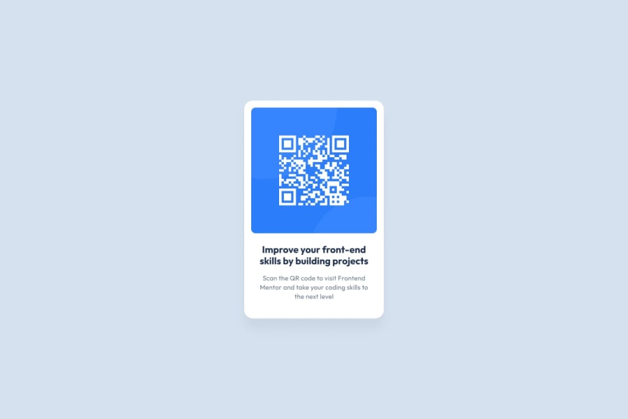
Design comparison
Community feedback
- @jordancareyuiPosted 9 months ago
Hi Jimovan, hope you're doing well! I'm trying to get through the learning path right now, and the site won't let me continue unless I review your 1-year-old code... Apologies for my random comment, and feel free to ignore it if you wish. 🙏
Overall, the solution looks really good! The preview has your text a bit misaligned, but I opened the page in my browser and it looks perfect there. I didn't end up using a CSS reset myself because I was afraid it would do too much, but I think that's a valid way of working with this challenge. The <article> tag you used for the card is interesting, I might look more into it.
The only issues I see with this solution are how vivid the drop shadow is and the lack of alt text for the QR code. The dimensions and color of the drop shadow seem good, but it'd benefit from a lower opacity. As for the lack of alt text, I can understand why you didn't include it since this project is so simple (and seems a bit inaccessible to low-vision screenreader users anyhow,) but something like alt="QR code" could help people who use tools or strip the styles of webpages when they browse the web.
Well done!
0 - @krushnasinnarkarPosted 9 months ago
Code Review
1. Semantic HTML
The HTML structure mostly follows semantic conventions but can be improved:
- Semantic Tags: Consider using
<header>for the<img>and<section>for the card content. - Accessibility: Use semantic tags like
<figure>for images that are self-contained content, with<figcaption>for any caption.
2. Accessibility
The current solution is reasonably accessible but can be improved:
- Alt Text: Ensure the alt text for the QR code image is descriptive enough.
- Focus: Check the tab order to ensure it’s logical. Add
tabindex="0"where necessary. - ARIA Attributes: Use ARIA landmarks if needed, but not excessively.
3. Responsiveness
The layout looks good on a range of screen sizes but consider these improvements:
- Media Queries: Explicit media queries for different screen sizes (e.g., mobile, tablet, desktop).
4. Code Structure, Readability, and Reusability
The code is well-structured
5. Design Consistency
The solution aligns with the design but can have slight improvements:
- Font Size: Ensure the font size for paragraphs matches the design guidelines (15px).
- Spacing: Match the exact spacing, padding, and margin as per the design specs.
These changes improve semantic structure, accessibility, responsiveness, and code organization while ensuring design consistency.
0 - Semantic Tags: Consider using
Please log in to post a comment
Log in with GitHubJoin our Discord community
Join thousands of Frontend Mentor community members taking the challenges, sharing resources, helping each other, and chatting about all things front-end!
Join our Discord
