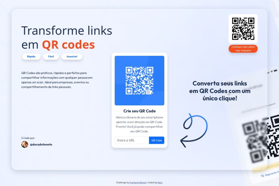
Design comparison
Solution retrospective
I’m most proud of how I managed to center the QR code component and ensure its responsiveness across different devices. Additionally, using Bootstrap’s utility classes made the styling process much easier. Next time, I would invest more time in customizing the styles, exploring more pure CSS, and possibly incorporating CSS Grid for a more complex layout of the elements.
What specific areas of your project would you like help with?I would like help in improving the accessibility of the project. I’m looking for guidance on how to make the component more accessible for users who rely on screen readers and other assistive technologies. Additionally, I’m interested in suggestions on how to further optimize the CSS code, whether in terms of organization, use of variables, or implementing best practices that I might have missed.
Community feedback
- @AtharvShelke4622Posted 8 months ago
Yes the solution includes semantic tags which are quite helpful.Styling helps to create eye-catching designs.Looking forward to the javascript.
0
Please log in to post a comment
Log in with GitHubJoin our Discord community
Join thousands of Frontend Mentor community members taking the challenges, sharing resources, helping each other, and chatting about all things front-end!
Join our Discord
