Design comparison
Solution retrospective
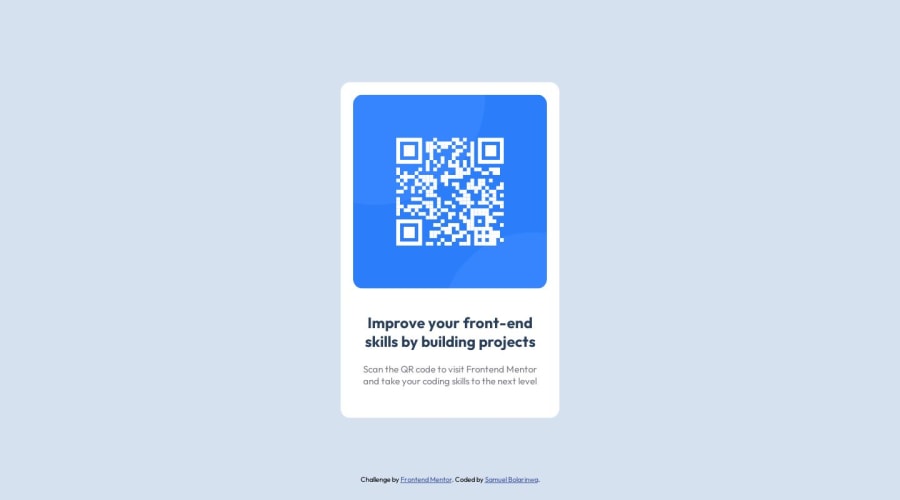
This is an HTML code for a QR code component. The code starts with a DOCTYPE declaration, followed by the HTML opening and closing tags. The head section contains the meta tag with the charset and viewport attributes, a link tag specifying the favicon for this webpage, a title tag, and a link tag that connects to a CSS stylesheet.
The header section refers to the part of a webpage that appears at the top of the page. In this case, there is no header section defined explicitly.
The body section is where the contents of a webpage go. In this case, there are two main div elements: a container and a qr-frame. Inside the qr-frame div is an image of a QR code, and inside the qr-text div is a heading and a paragraph of text.
At the bottom of the HTML file, there is an attribution div, which specifies the author of the code and the original challenge.
This is a CSS stylesheet for a QR code component.
The first line imports two different font families from Google Fonts and specifies that the DM Serif Text font should be used in the body text and the Outfit font with 400 and 700 weights should be used in other elements of the webpage.
The second line sets all elements to use the border-box model, which ensures that the width and height of an element includes its padding and border.
The third line sets the font family for the HTML element to "Outfit", Arial, Helvetica, sans-serif.
The next few lines style the body element, setting a background color, removing padding and margin, so that the component takes up the full width and height of the window.
The .container div is styled to have a white background color, padding, width, position (absolute), and a 50% transform to center it horizontally and vertically. It also has some additional styling for text alignment and border radius.
The .qr-frame div just has a width of 100%.
The .qr-text div has some padding and styles for the paragraph and heading elements.
The .qr-frame img is set to take up 100% of the width of the containing element and has a border radius of 15px.
The .attribution div contains some styling for a credit that appears at the bottom of the page.
There is also a media query that sets the properties of the .container div to different values when the viewport width is less than or equal to 414px. In this case, the container div gets a width of 95vw and a height of 88vh.
Community feedback
- @mandriva19Posted over 1 year ago
hmm you happened to use AI for writing up the description?
1 - @Aimal-125Posted over 1 year ago
Bro in your css code, use media query with orientation: portrait; and set the .container to position: initial; or give the body element height of 120 or 150vh so that your card is visible on screens with small heights. As it is not visible on my j3 mobile device.
0
Please log in to post a comment
Log in with GitHubJoin our Discord community
Join thousands of Frontend Mentor community members taking the challenges, sharing resources, helping each other, and chatting about all things front-end!
Join our Discord
