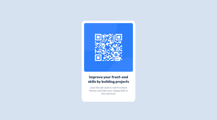
Design comparison
Solution retrospective
Any feedback is greatly appreciated!
Community feedback
- @SamadeenPosted about 3 years ago
Hey!! Cheers 🥂 on completing this challenge.. . Here are my suggestions
-
You can use the transform property to scale down your card a little bit.
-
Its preferable to use %, em, rem, vh, vw, instead of px in most cases.. it helps in responsiveness.
-
Its best you use CSS variables especially when you have values you are using reoccurringly . Regardless you did amazing.. Happy coding!!!
1 -
- @mamba-dev-KEPosted about 3 years ago
Hey there, nice implementation here. My recommendation for you here is to:
- Explore more use of relative units i.e. rem, em, ch, % as opposed to fixed units such as px as they are the best when working with responsiveness in mind.
- For example, you have set a fixed width and height for the card. The best way to achieve this would be to use percentage (%) on the card and set a max-width on your container to control the growth of the card.
- You can also leave height to be auto calculated based on the content of your card instead of setting an explicit fixed height.
- Explore custom properties in CSS for setting the properties that are are used in many elements as this would make your code more maintainable in case you need to change something that has been used multiple times.
1@RyanFloresTTPosted about 3 years ago@mamba-dev-KE Thanks for the tip on using relative units, it’s something I’m conscious of not doing, but I often don’t know which one to use. I’ll spend some time to learn about those more carefully, along with custom CSS properties. Thanks again! :D
1@mamba-dev-KEPosted about 3 years ago@RyanFloresTT I use rems for font-sizes, max-width and everything that is traditional sized with pixels. I use em for padding and margin so that they are flexible to grow and shrink with the font-size set on an element, and ch to set max-width of text content... check out the below video by the Master of CSS Kevin Powell for more info and outlook into this ---> https://youtu.be/N5wpD9Ov_To
Marked as helpful1 - @Akhlak-Hossain-JimPosted about 3 years ago
Great work Ryan. Try these recomandations:
- your code
<footer>
      <div class="attribution">
        Challenge by
        <a href="https://www.frontendmentor.io?ref=challenge" target="_blank"
          >Frontend Mentor</a
        >. Coded by <a href="https://github.com/RyanFloresTT">Ryan Flores</a>.
      </div>
    </main>
</footer>
Should be
</main> <footer> <div class="attribution"> Challenge by <a href="https://www.frontendmentor.io?ref=challenge" target="_blank" >Frontend Mentor</a >. Coded by <a href="https://github.com/RyanFloresTT">Ryan Flores</a>. </div> </footer>- try using css variables
Happy coding:)
1@RyanFloresTTPosted about 3 years ago@Akhlak-Hossain-Jim Oh nice catch! I’m not sure how I missed that, I’ve got to start proof reading my code before I submit it. I just learned of CSS variables, I’ll try to use them more often, thanks for the help! :D
0
Please log in to post a comment
Log in with GitHubJoin our Discord community
Join thousands of Frontend Mentor community members taking the challenges, sharing resources, helping each other, and chatting about all things front-end!
Join our Discord
