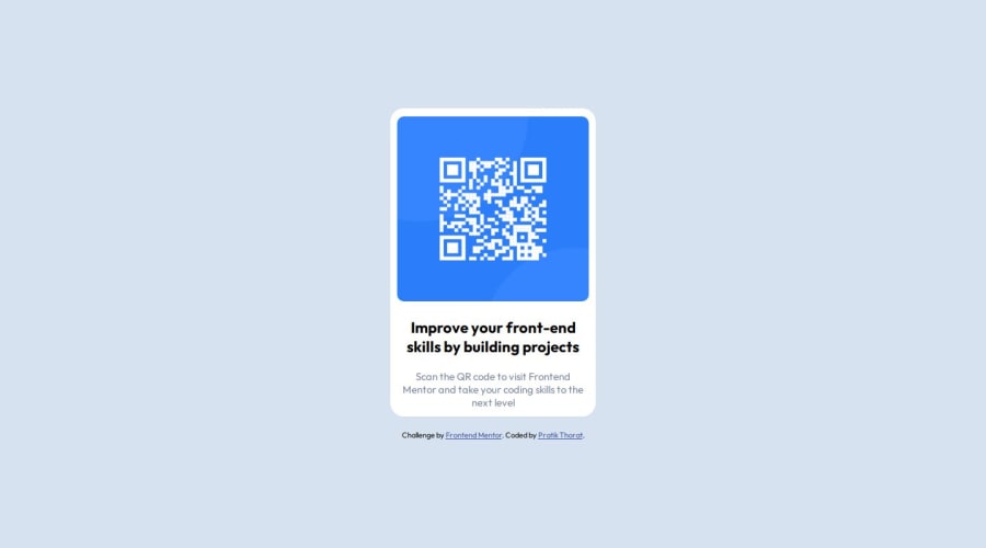
Design comparison
SolutionDesign
Solution retrospective
This project was a fairly easily challenge and a good warm. Or so i thought. I can say that a decent understanding of HTML and CSS is an absolute must. I was able to quickly build the design using flexbox. In challenges coming forth, I will focus more on best practices and code quality over just building and making it work.
Community feedback
- @LucianoDLimaPosted 10 months ago
Well done and welcome to the community :D
Just a few corrections you could make since your project already looks very good:
- You're adding all the text directly inside the
<div>
tag. Consider using correctly semantic HTML, so instead of div, you could use a<p>
tag, which represents a paragraph:
<div class="qr-text-thin"> Scan the QR code to visit Frontend Mentor and take your coding skills to the next level </div>
you could
<p class="qr-text-thin"> Scan the QR code to visit Frontend Mentor and take your coding skillsto the next level </p>
Marked as helpful0@PratikThoratNortheasternPosted 10 months ago@LucianoDLima Thank You for the suggestions. I genuinely appreciate the help!
0 - You're adding all the text directly inside the
Please log in to post a comment
Log in with GitHubJoin our Discord community
Join thousands of Frontend Mentor community members taking the challenges, sharing resources, helping each other, and chatting about all things front-end!
Join our Discord